GDUSA Package Design Awards 2026 - 2026
Home, Garden & Industrial
KitchenAid’s small appliance portfolio is one of the most recognized in the world, yet its packaging system had remained largely unchanged for more than a decade. As competition intensified and operational complexities multiplied across hundreds of SKUs, the brand faced a dual challenge: streamline packaging production and modernize the consumer experience.
At the same time, consumer attitudes and lifestyles had been evolving for years. The brand, unrefreshed for a decade, lie sleeping at retail. KitchenAid was facing stiff competition from much younger brands like SharkNinja, SMEG, Nespresso and others. To help KitchenAid seize the moment, CBX transformed what began as a cost-reduction initiative into a brand-building opportunity.
Research
Portfolio Architecture
Design Strategy
Brand Identity – Visual System
Packaging Design
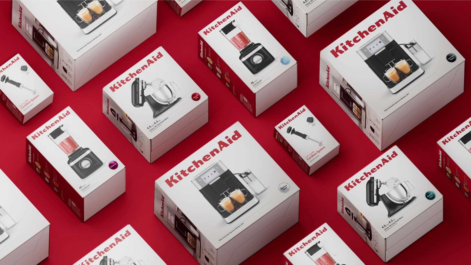
Rather than treating KitchenAid as an appliance manufacturer, CBX reframed it as a lifestyle brand, recognizing that consumers choose these products not only for performance, but also for how they fit into their homes, kitchens, and daily lives.
Consumers don’t simply buy these products. They live with them. Appliances sit proudly on countertops, become part of a home’s aesthetic, and enable the rituals of cooking, baking, gathering, and creating. Yet existing packaging leaned heavily into features and functionality, leaving little room for the emotional connection that had helped make KitchenAid a cultural icon.
Through consumer research, shelf analysis, and strategic exploration, we developed a new global packaging system designed to move the brand from a highly functional, information-heavy experience toward one that was more emotional, approachable, and inspiring.
The resulting design direction, ultimately named “Warmth of the Kitchen,” transformed packaging from a utilitarian information system into a richer brand experience.
The refreshed architecture introduced stronger use of KitchenAid’s signature red, creating a more distinctive and recognizable shelf presence regardless of how products were merchandised. Branding was extended across every visible panel, ensuring the brand showed up consistently from every angle. Lifestyle imagery showcased the moments appliances help create, allowing consumers to envision products in their own homes rather than simply viewing them as machines.
At the same time, the design brought clarity to an increasingly complex portfolio. Information hierarchies were simplified, navigation improved, and layouts were designed to flex seamlessly across regions, languages, and regulatory requirements. A new color-indicator sticker system reduced the need for color-specific packaging and product photography, streamlining production while helping consumers identify products more intuitively.

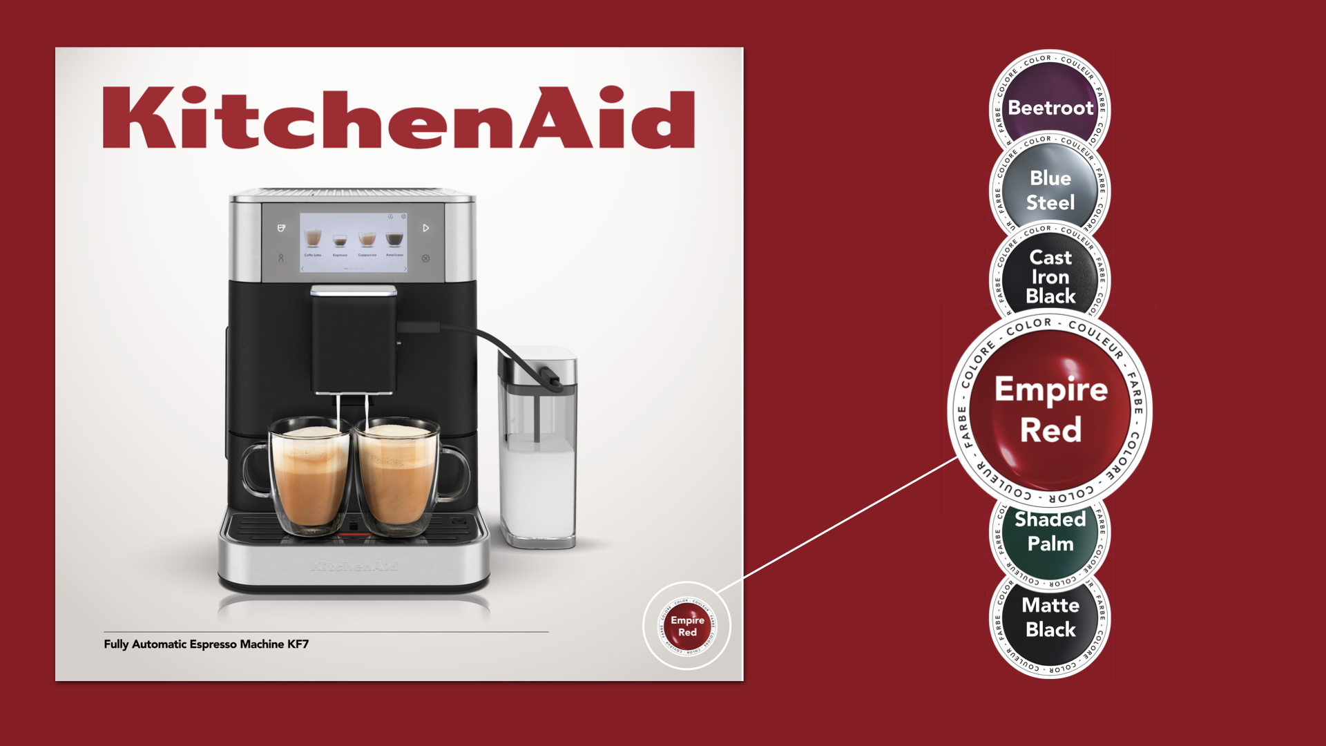
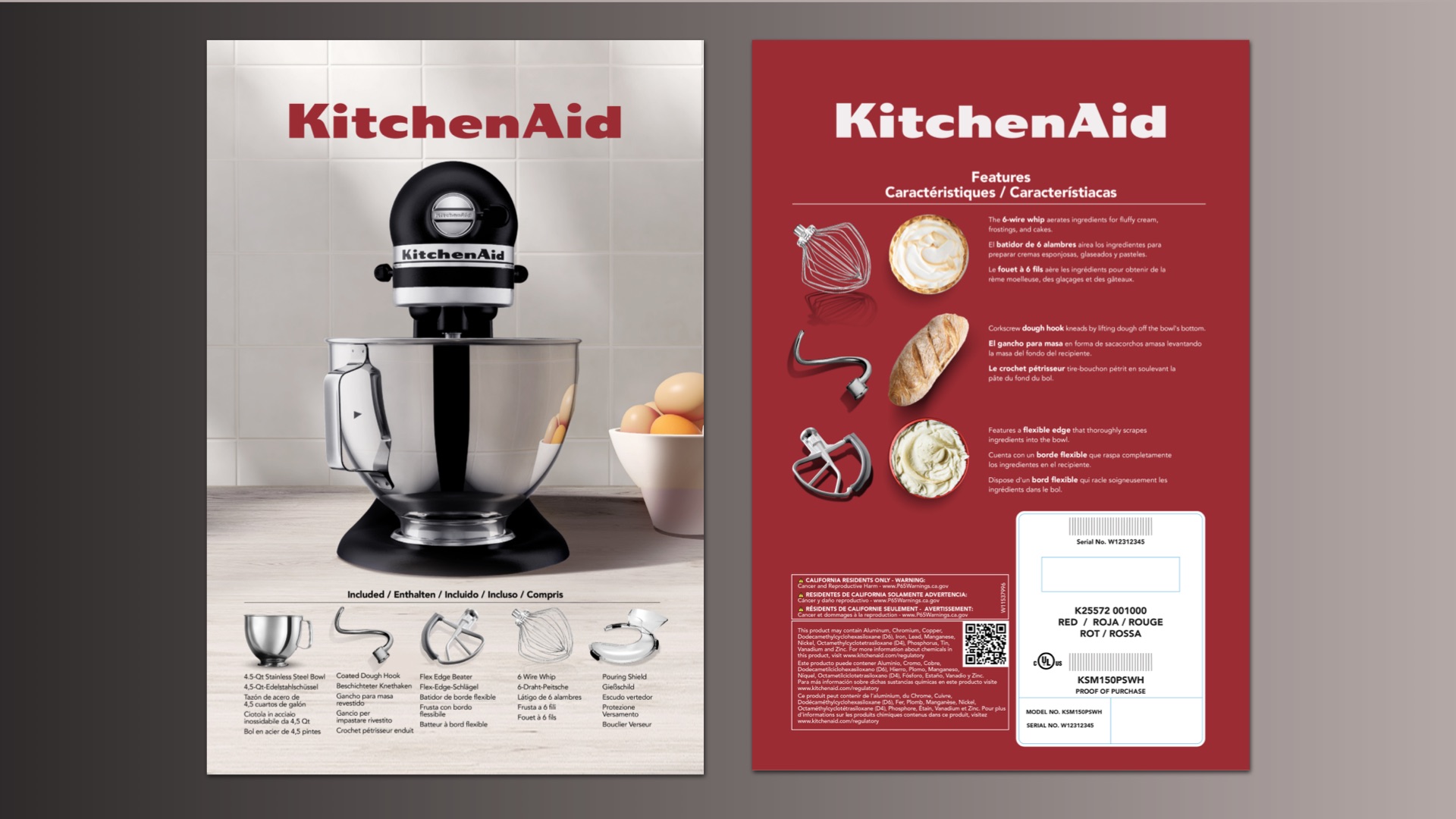
By reimagining packaging as both a brand asset and a business tool, CBX helped KitchenAid modernize one of its most important consumer touchpoints for the first time in more than a decade. The result is a globally scalable packaging ecosystem that increases visibility, improves shopability, simplifies complexity, and reinforces KitchenAid’s role at the center of the modern kitchen.
Home, Garden & Industrial
“As we evolved our packaging, our goal was to create a design that feels modern and relevant while still carrying the familiarity and warmth people associate with KitchenAid around the world. The packaging is the first touchpoint of that experience; it sets the tone for what’s inside and invites consumers into a more intentional, inspired way of living in the kitchen.”
Sophia Costabal, Associate Director, Global Brand Marketing at KitchenAid
Loading the form…
