GDUSA - 2026
Health + Pharmaceuticals
Trojan owns more shelf space than any other brand in the condom category, but its expansive portfolio had become difficult to navigate. A growing number of products, benefits, sizes, and sub-brands created a wall of near-identical packs that shoppers struggled to decode quickly, limiting conversion in a category where purchase decisions are often made in seconds.
At the same time, Trojan’s visual identity leaned heavily masculine, limiting its sense of approachability. As conversations around intimacy and sexual wellness evolved, the brand had an opportunity to feel more relevant to a broader audience while preserving the trust and authority it had built over more than a century. The challenge was to modernize the brand, improve shopability, and create a more inclusive expression while protecting Trojan’s most recognizable equity assets.
Design Strategy
Visual Identity System
Packaging design
Brand World
Photography & Illustration
3D Packaging Renders
Brand Guidelines
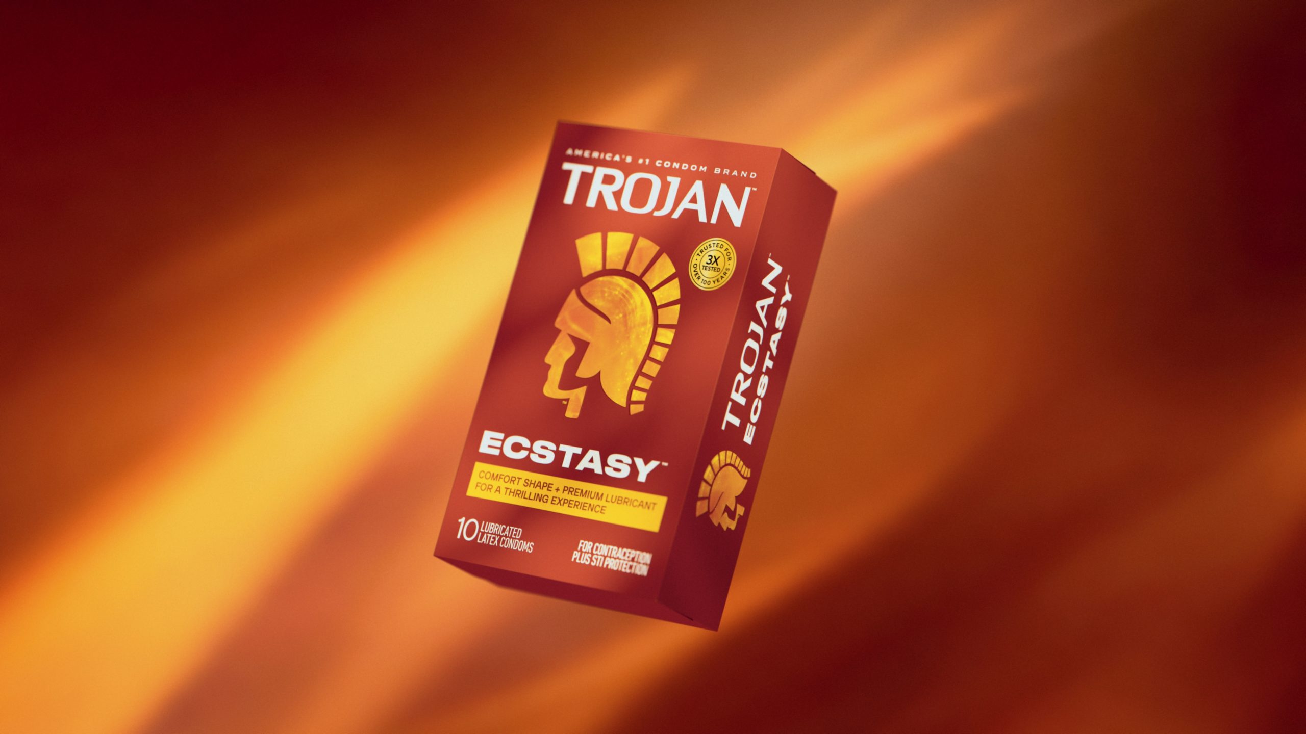
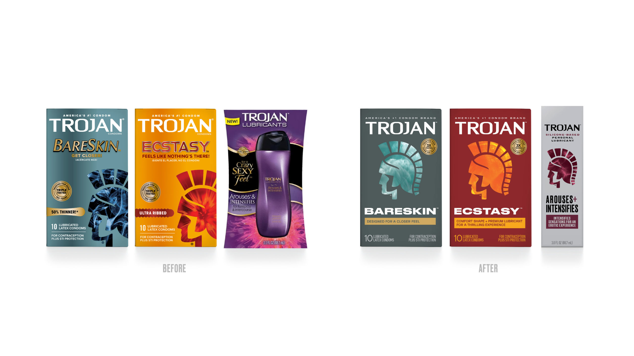
We approached the project as an architecture challenge before a packaging challenge, creating a unified system that could organize the portfolio while making it easier for consumers to find the right product. Research revealed that product benefits were the strongest purchase driver, so we restructured hierarchy around clear benefit communication, improving navigation across the shelf.
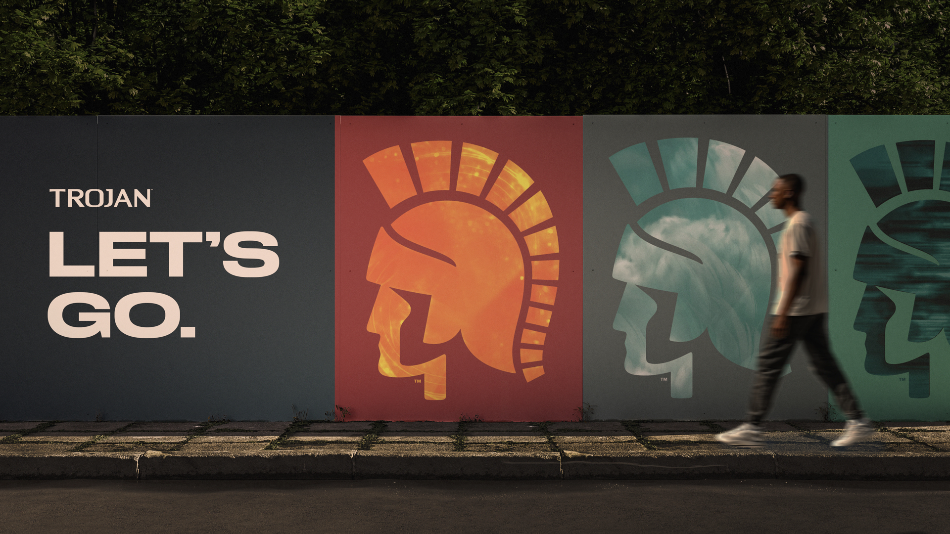
At the same time, we evolved Trojan’s visual identity to feel more modern, approachable, and relevant to a wider audience without losing the equities that made the brand iconic. The Trojan helmet remained the centerpiece of the system, reinforcing trust, protection, and leadership, while refined typography, color, imagery, and texture shifted the brand away from a traditionally masculine presentation toward a more gender-neutral expression rooted in intimacy, confidence, and connection.
The resulting design system balances clarity with character, creating stronger differentiation across the portfolio while allowing Trojan and Magnum to express distinct identities within a cohesive family. By building on the brand’s existing equities rather than replacing them, the system broadens Trojan’s appeal and positions the brand for the future of sexual wellness.
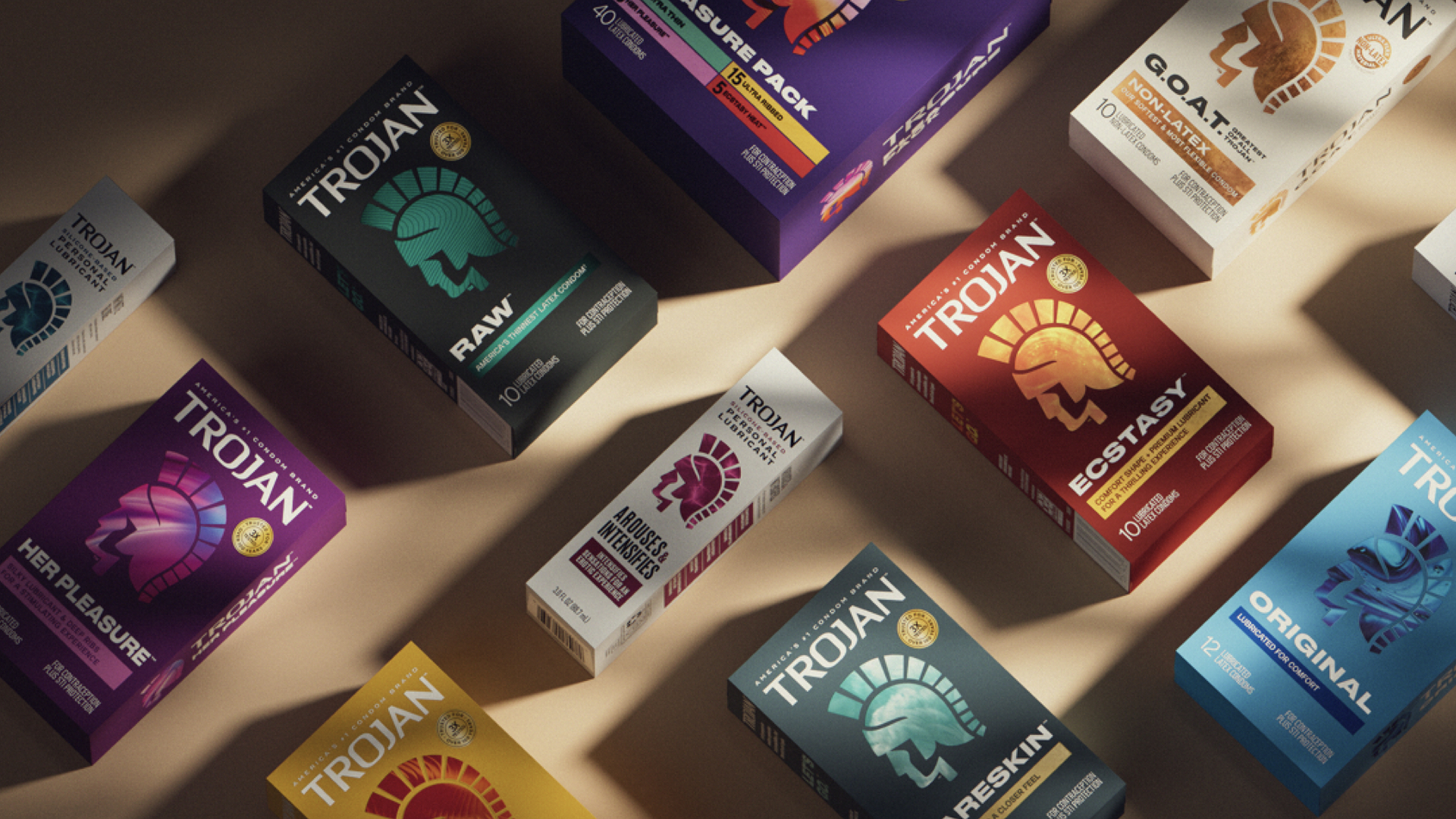
For a brand built on trust, the impact of the work was simple: making it easier for consumers to find the right product, feel confident in their choice, and reconnect with the category’s most recognized name.
Health + Pharmaceuticals
Loading the form…