The Call
With brands like Hershey’s®, Kit-Kat®, Reeses®, Twizzlers®, and the iconic Hershey’s Kisses®, The Hershey Company is known and loved as an American institution through its leading candy brands. Like other corporate brands born from a product brand, The Hershey Company’s logo and visual assets didn’t tell the organization’s full story and vision for growth. With a growing and successful snack business, The Hershey Company needed to refresh their visual and verbal corporate assets to represent the breadth of their businesses, the diversity of their people, and their opportunity for growth now and in the future.
Recognizing the passion and energy their employees bring to their businesses, The Hershey Company also wanted to provide their staff with the tools and guidelines to enable their people to express themselves as they live the Hershey purpose of “Making More Moments of Goodness.”
What we did
Brand strategy
Design strategy
Visual identity
Marketing collateral
The Work
CBX worked closely with Hershey teams to understand how they used the corporate assets. From there, a consistent tone of voice and verbal strategy were developed.
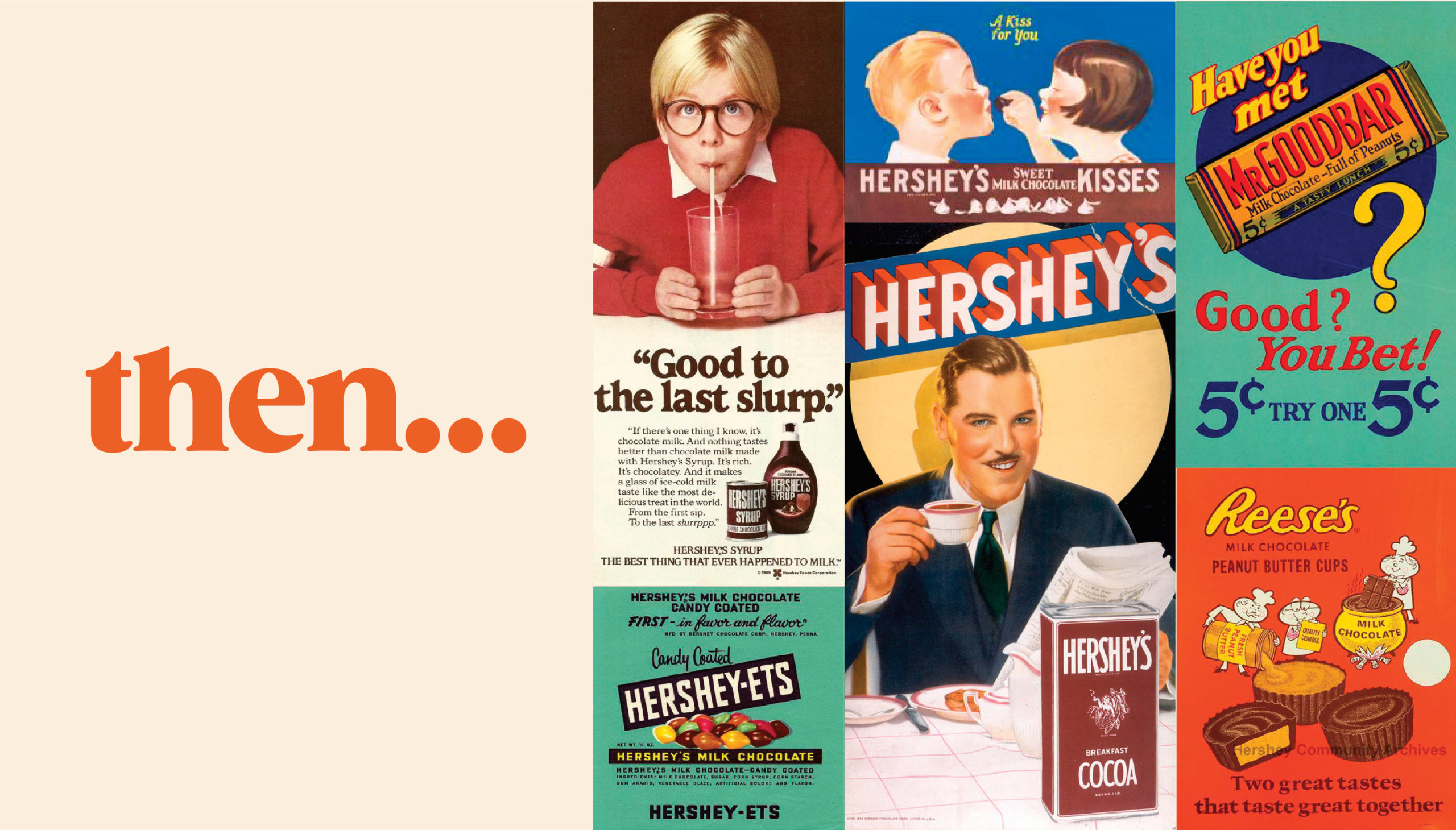
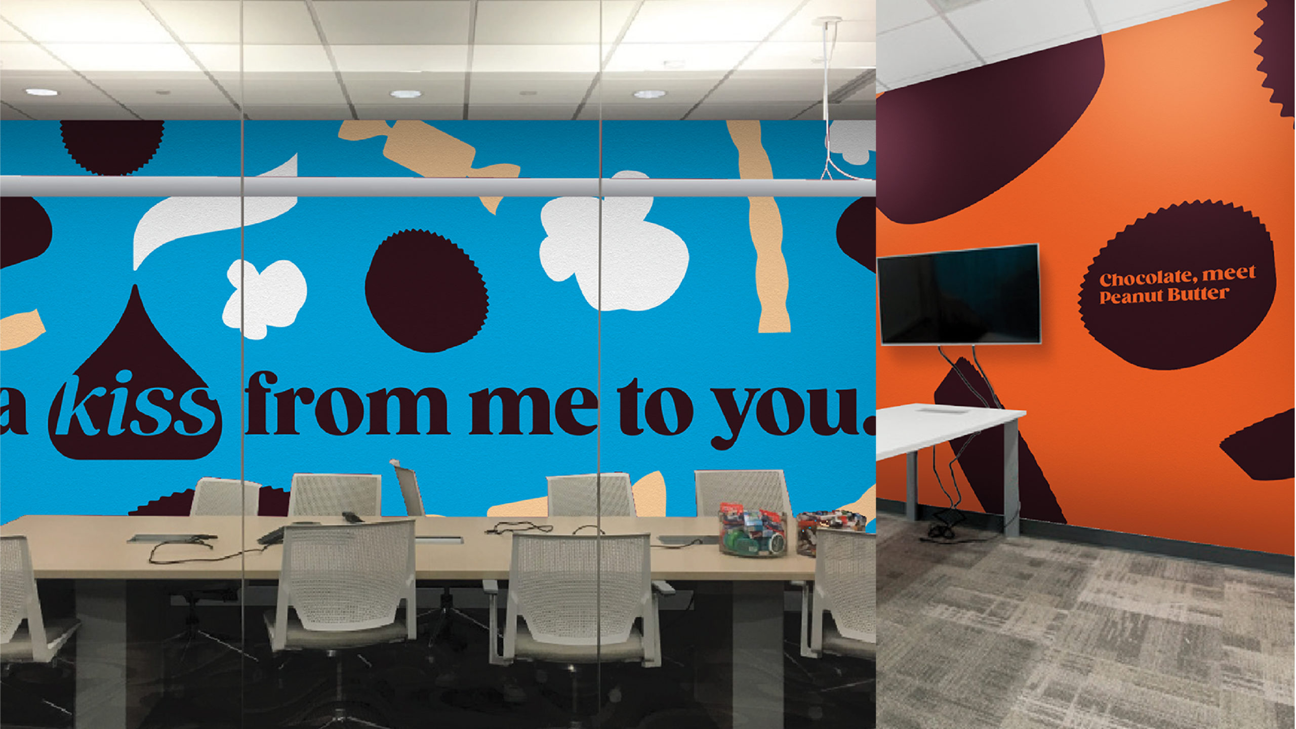
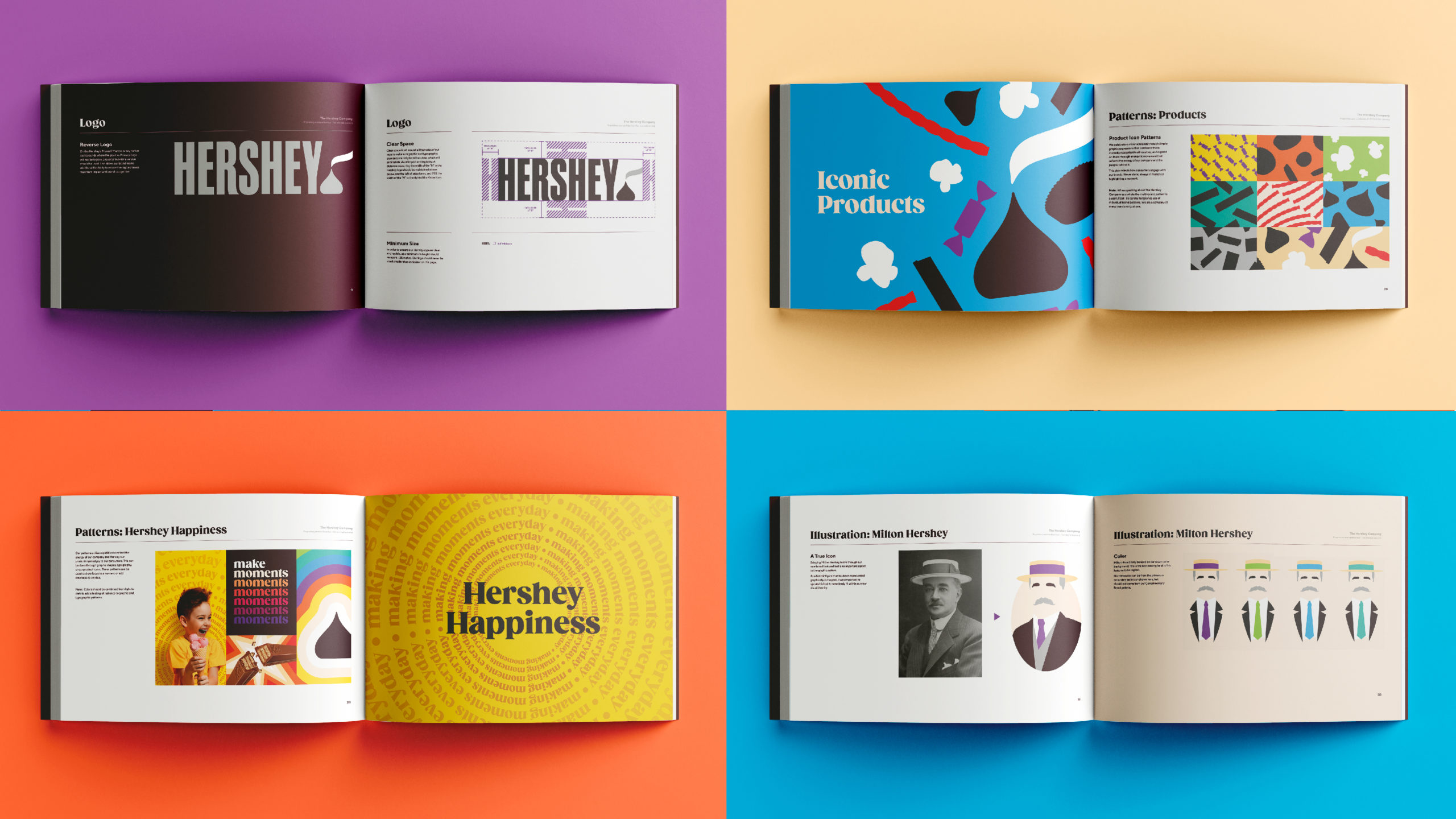
For the visual system, CBX drew inspiration from historical advertisements and type, as well as photography (including Milton Hershey himself), and how they portrayed Hershey’s rich heritage. Modern silhouettes were created to reflect the array of products, while bright, optimistic colors (added to the primary Hershey’s palette) helped represent the diversity of the brand.
Today, the vibrant illustrative representation of “Making More Moments of Goodness” is recognized across all communication with typography, tools (templates, email signatures, Word docs, etc.), brand guidelines (to differentiate between corporate and various product brands), guardrails (what’s acceptable to team for lockup or logo and ways to customize), and the brand narrative.
The Impact
- Hershey’s launched their new corporate brand identity at the year-end town hall, and within the hour several employees were asking for the deck template and any other collateral material they could use right away.
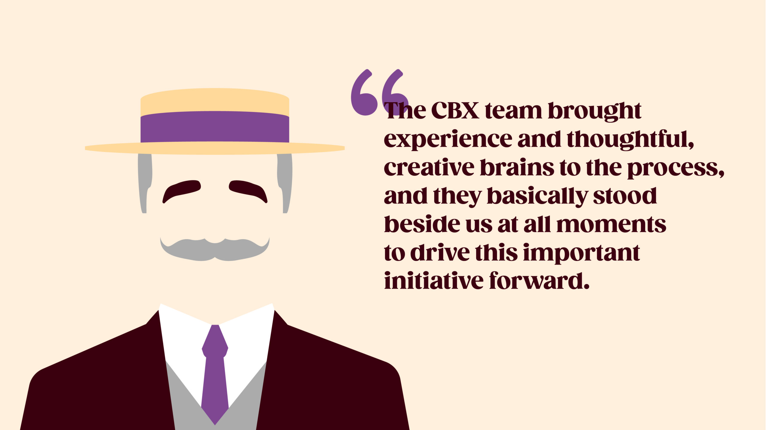
- These moments, now in tangible form, started a real momentum within the Hershey’s family. Once the teams understood the back story and how the new deliverables are rooted in and celebrate Hershey’s legacy, it was instantaneously embraced, as evident from their responses:
