The Call
Over the past two decades, The J.M. Smucker Company has transformed from an $800 million jams and jellies company to a $7.8 billion multi-category leader of food and beverage products tailored for each generation of people and pets.
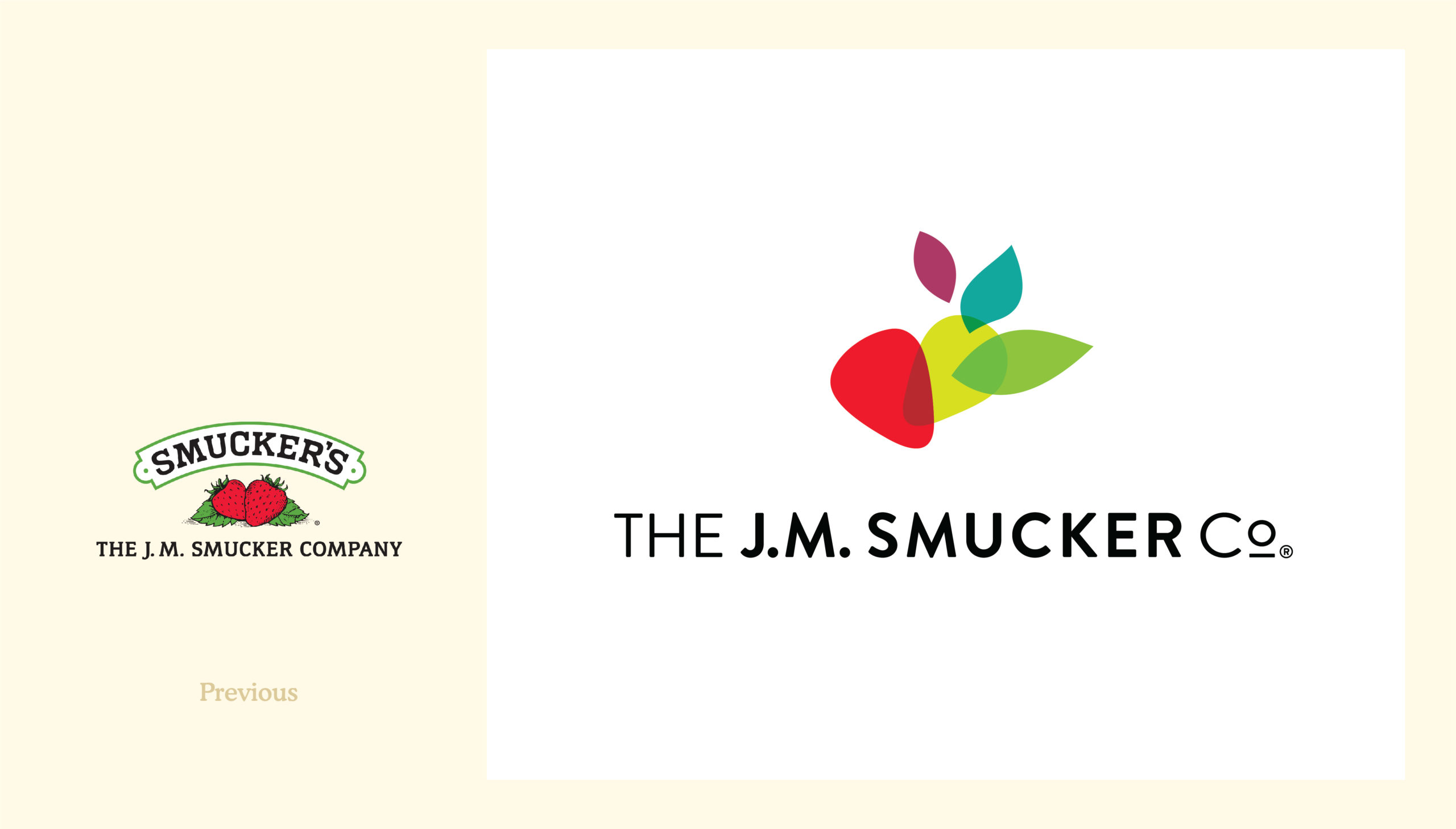
While highly recognizable for the iconic jams and jellies namesake products, the corporate mark didn’t reflect what the company had evolved into today: a leading food and beverage company with a diverse portfolio of over 40 brands in the coffee, pet food, pet snacks, peanut butter, and snacking categories. In addition, there was an opportunity to more meaningfully demonstrate the Company it has become: a forward-thinking organization invested in innovation and analytics, and a growing business with progressive leadership and exciting career opportunities.
How do you evolve an identity that will best represent who The J.M. Smucker Company is today and their ambitions for the future, with respect to its deep roots and family heritage?
What we did
KEY STAKEHOLDER AUDIT
DESIGN STRATEGY
BRAND IDENTITY DESIGN
CORPORATE IDENTITY SYSTEM
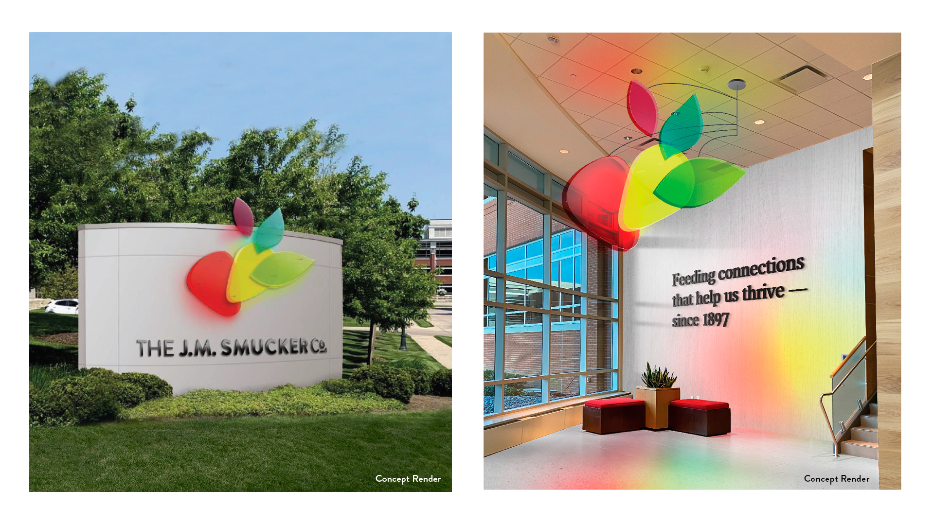
BRAND ENVIRONMENT
The Work
In-depth interviews with Smucker executive leadership, including CEO Mark Smucker, provided alignment that the degree of change required should be significant from how the brand mark is visually represented today, and emphasized the importance of an inclusive creative process where employees were brought into the journey.
Surveys and cross-functional workshops with both longtime and new employees reinforced the importance of retaining the values that continue to shape the organization, while exploring visual and verbal themes that could best represent the Company today and tomorrow.
The new identity and visual system celebrate both the Company’s heritage and its innovative growth. The core of the logo is rooted in the legacy and heritage of the strawberry to anchor the mark, includes a pivot point to convey change, and has movement of shapes to express the future. The mark captures the essence of the stability afforded by five generations of family leadership and how this has supported the Company’s transformative growth and evolution to meet the changing needs of all constituents. The extended visual world brings to life a layered story of vibrant colors, dynamic patterns, and youthful energy that speak to both the diversity of their portfolio and the ambitious growth they will continue to experience.
The Impact
We chose CBX because we knew as a partner they had a very healthy respect and understanding of where we came from, but they also had the ability to push us forward and help us think outside the box in terms of what this new identity really could mean for our employees, investors, and potentially even future employees.
Kara Buckler, Director, Creative Services, The J.M. Smucker Co.