The Call
How do you help an iconic American brand update its identity and storytelling while solidifying its place of prominence on shelf?
What we did
Design Strategy
Brand Architecture
Brand Identity Design
Packaging Design
The Work
Land O’Lakes consumers liked the brand but research showed they had limited visibility into its heritage as a farmer-owned cooperative. In today’s environment, it matters.
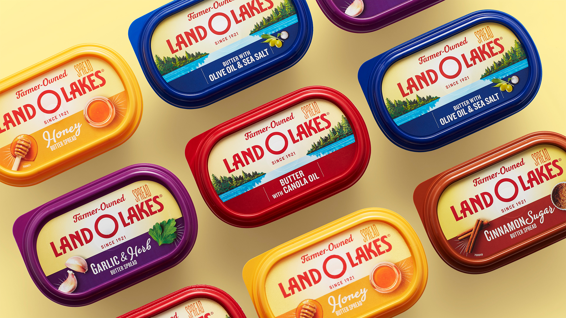
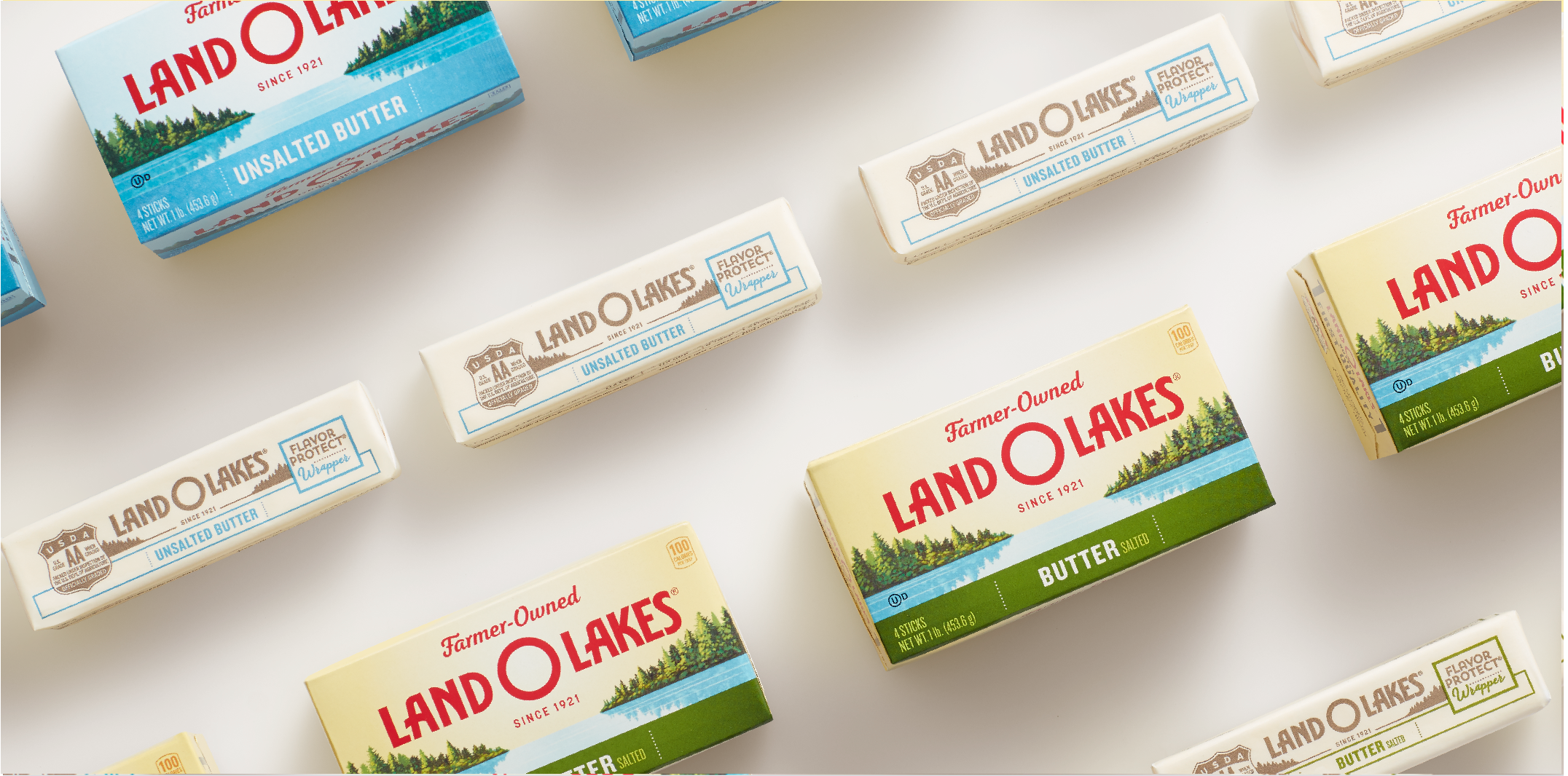
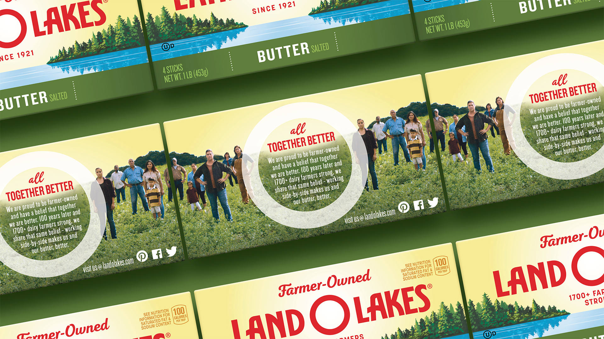
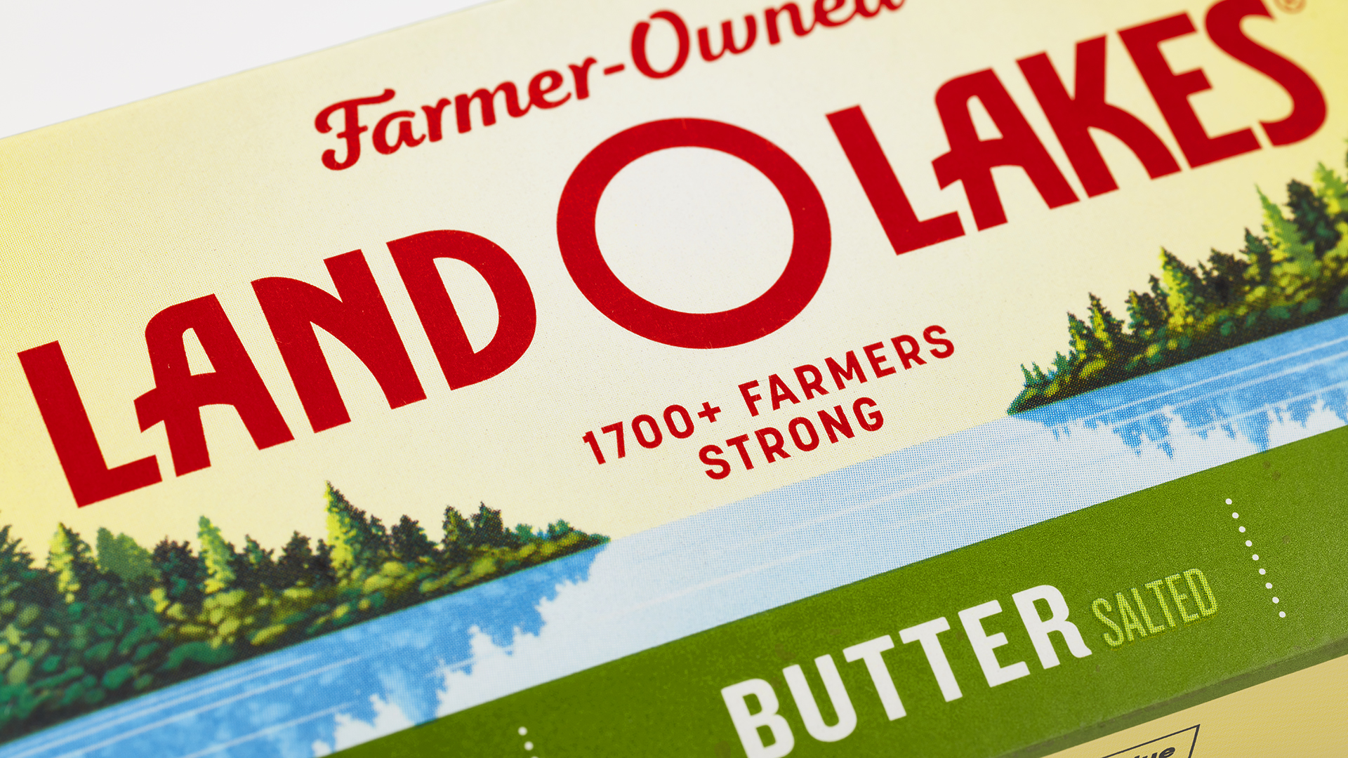
We connected “farmer-owned” directly to the brand mark on pack, updating the design and using photography of actual Land O’Lakes farms to tell a more expansive story about simple goodness. We also simplified the brand mark to create a bull’s eye effect, giving it more impact at shelf. And more consistent flavor naming and color-coding helped simplify the product architecture, making the flavored spreads easier for consumers to discover and shop.
The Impact
- Consumer research showed that the new packaging actually improved purchase intent and overall appeal. It also scored higher on several key brand attributes.
- Stronger brand impact at shelf with a more uniform packaging design across products.
- Improved shop-ability through stronger branding and more consistent flavor descriptions.