INTRODUCTION
When Familiarity Becomes a Blind Spot
Iconic brands earn their status by embedding themselves into culture. Over decades, they accumulate trust, recognition, and emotional resonance. But with that deep familiarity comes a strategic vulnerability: when consumers know a brand so well that they no longer notice it.
The result is a paradox, high recognition but low visibility. The brand remains a category constant but loses its ability to command attention, signal meaning, or shape consumer choice in a rapidly shifting marketplace.
This tension is especially common in mature CPG categories, where long-standing leaders risk slipping into what behavioral economists describe as "habit loops": purchased, remembered, but no longer actively chosen. Canada Dry found itself at exactly this crossroads.
PRINCIPLE 1
Cultural Leadership Requires Renewal, Not Reinvention
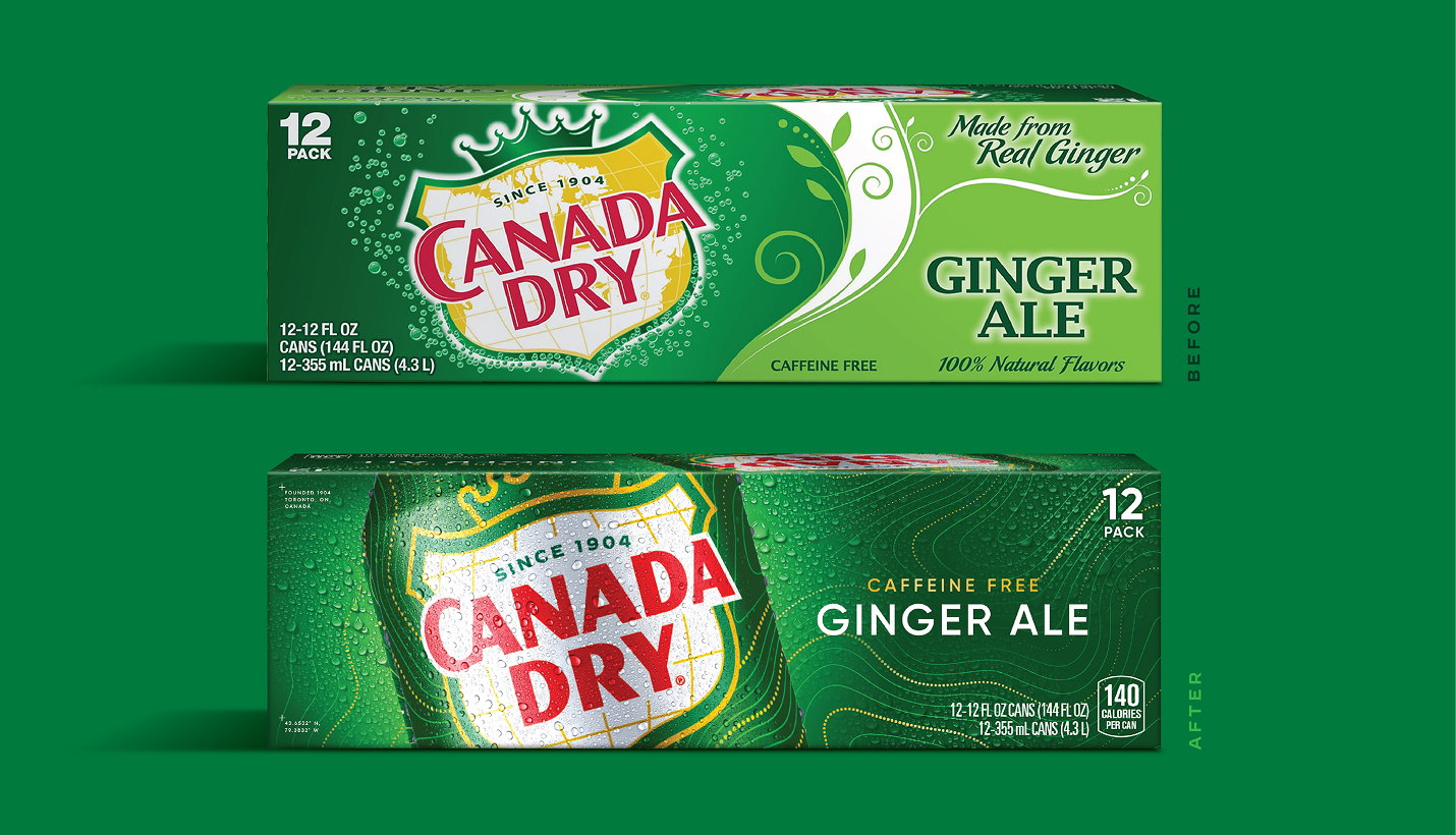
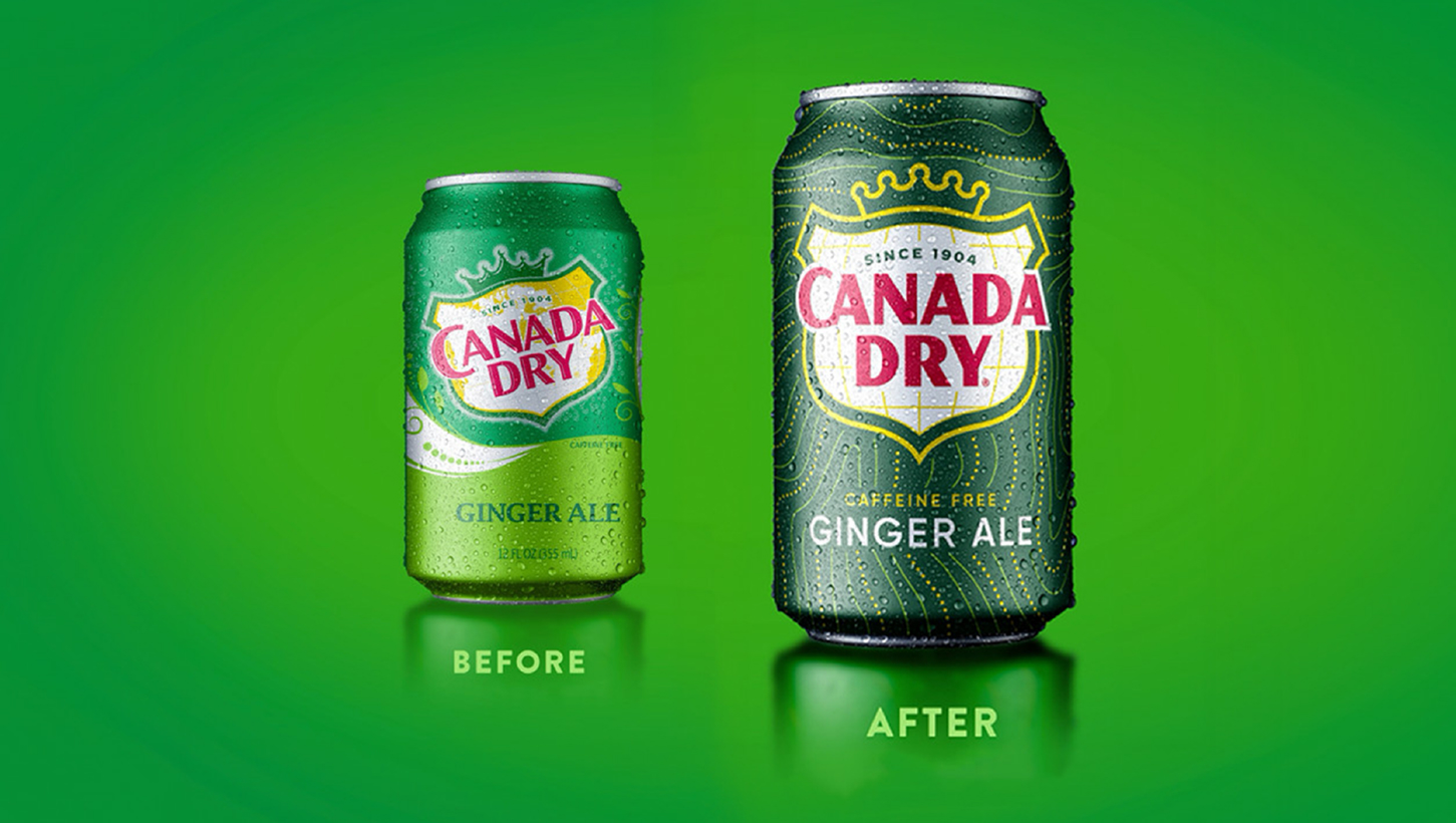
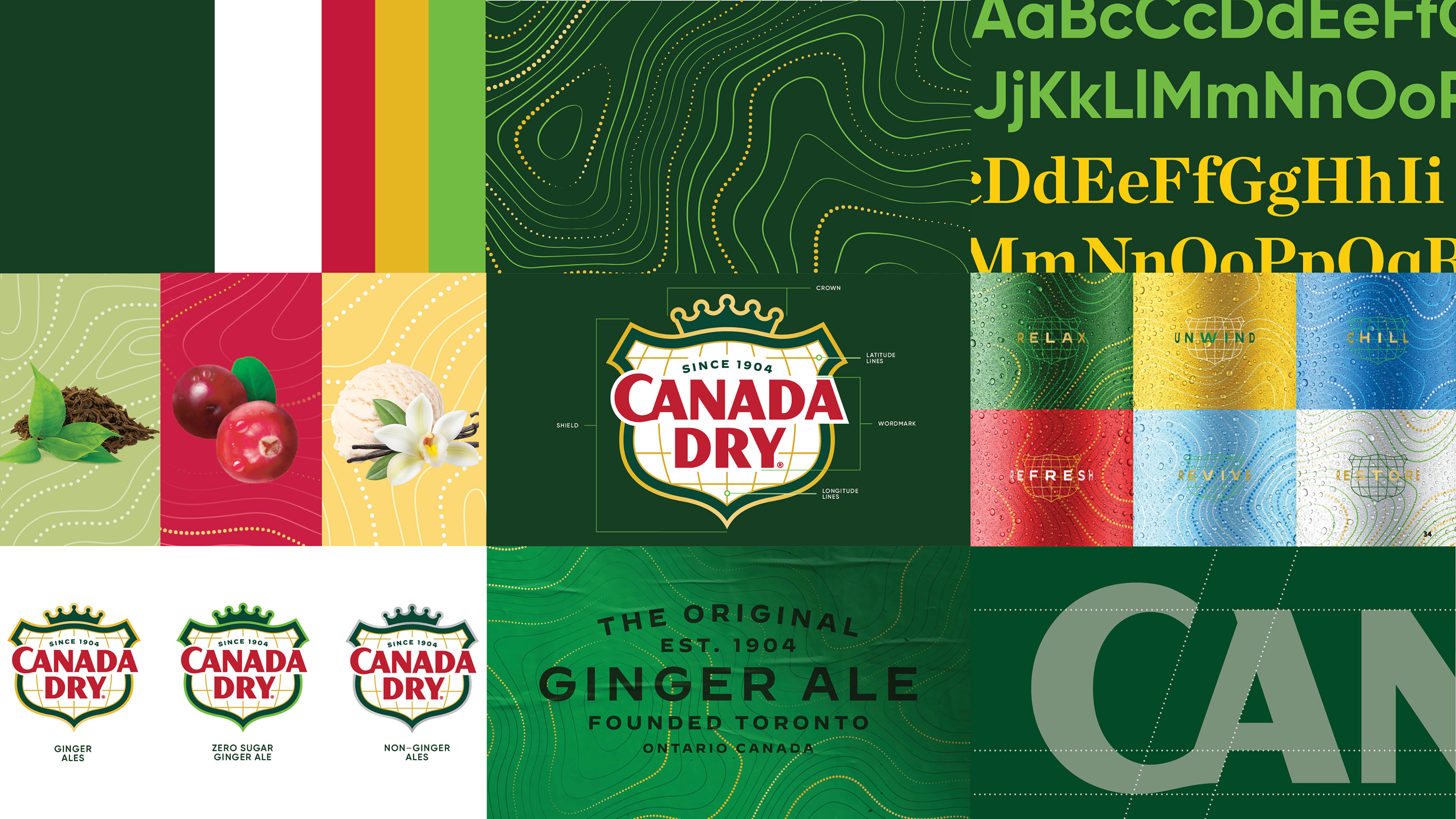
Canada Dry has defined the ginger ale category for more than a century. Its equities — the shield, the green palette, the premium cues — carry cultural weight. But as the marketplace evolved, those symbols needed renewed energy to remain legible and relevant.
The challenge wasn't to replace these equities; it was to optimize them so consumers could see them again.
Enhancing the visual registration and recognition of the elements that embody the brand in the minds of consumers amplifies both focus and impact. When a brand’s most iconic visual equities are elevated, clarified, and consistently expressed, they become faster and easier for consumers to process—whether on shelf, on screen, or in motion. This immediacy not only helps the brand break through competitive visual clutter, but also deepens mental availability by reinforcing the cues people instinctively associate with its story, values, and promise. Ultimately, maximizing these equities transforms every consumer touchpoint into a more efficient, memorable, and emotionally resonant brand encounter.
This pattern is visible in other long-standing brands whose visual equities were strong but had become visually dormant. Their goal wasn't change for its own sake, but re-energizing the signals consumers rely on.
Canada Dry's evolution followed the same principle: restore vitality without disrupting meaning.
PRINCIPLE 2
Distinguish Meaningful Heritage From Accidental Familiarity
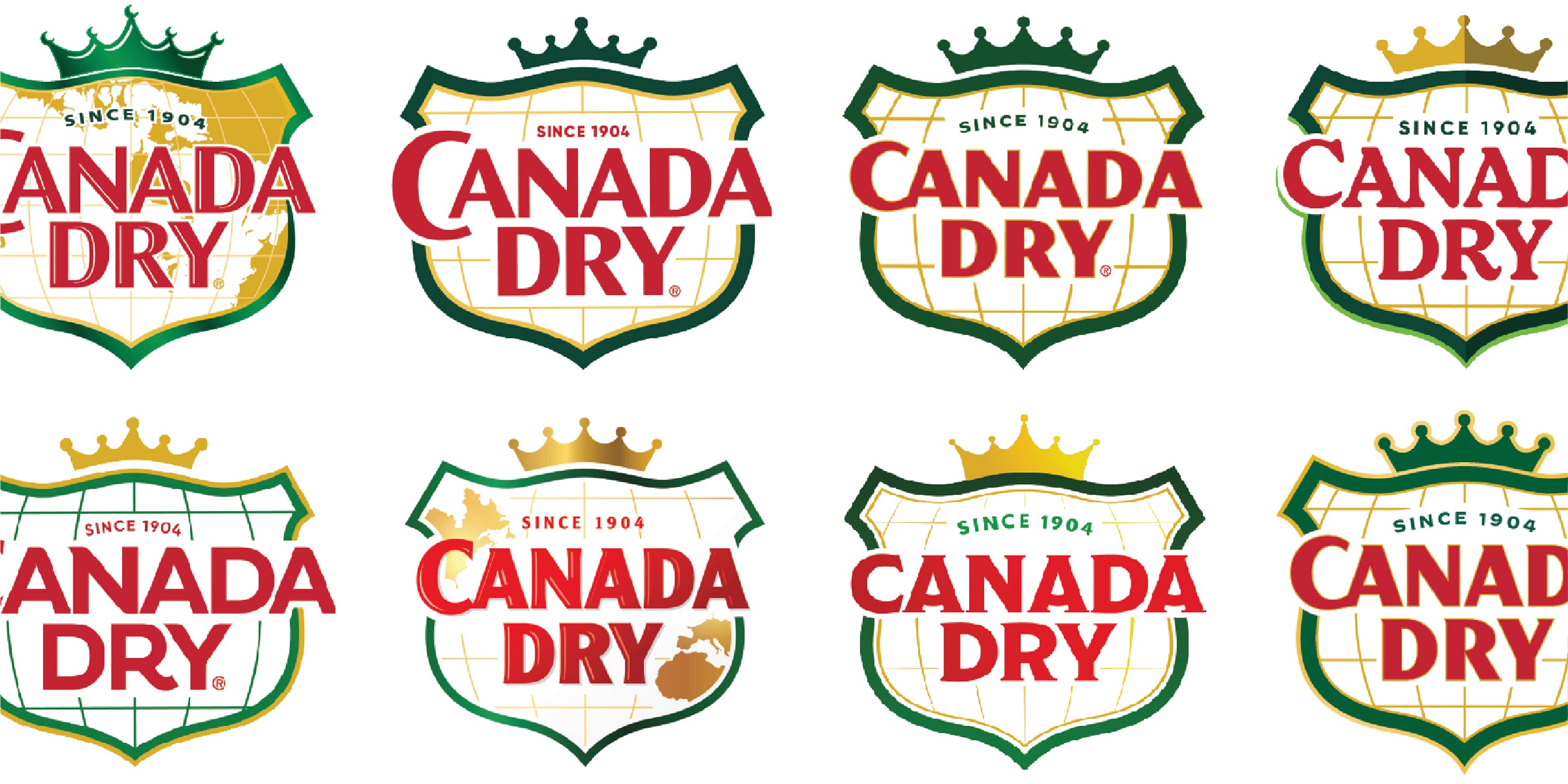
Long-established brands accumulate visual elements that persist over time, not because they hold equity, but because they’ve never been questioned.
A disciplined audit revealed which elements of Canada Dry’s identity were truly carrying emotional significance and which had outlived their usefulness. The shield remained foundational. The internal map, once a symbol of provenance, had lost both clarity and relevance. Removing it wasn’t an act of minimalism; it was an act of focus.
Brands have evolved by intentionally stripping away visual noise, allowing their core distinctive elements to become more identifiable at a glance. As design trends shift toward greater clarity, restraint, and digital-first readability, marketers must be increasingly conscious of what truly drives recognition—and what merely adds clutter. Yet many teams still underestimate the value of conducting visual equity research, overlooking how this upfront investment can pay significant dividends in the creative process. Research focused on design and visual equity helps clarify which assets consumers actually rely on to identify the brand, and which elements—no matter how familiar internally—no longer carry meaning in the marketplace. This insight is essential when navigating the sometimes uncomfortable decisions to refine or remove legacy visuals that no longer serve strategic needs. By embracing a disciplined, insight-led approach to simplification, brands can ensure their most powerful cues rise to the surface, strengthening visibility, coherence, and long-term relevance.
The lesson: heritage is an asset only when it remains meaningful.

PRINCIPLE 3
Modernization Should Elevate Craft, Not Erase It
The process of refining Canada Dry’s identity revealed that certain features embedded in its history still held latent power. Most heritage brands were born in an era when logos weren’t derivative of a font from a digital font library—they were drawn, shaped, and refined by hand. Typography was crafted, not chosen. Illustrations were meticulously rendered by artists whose work carried subtle imperfections, warmth, and personality. Over a century of redesigns, that level of craftsmanship can easily be diluted or discarded, especially as brands modernize, digitize, and simplify.
In Canada Dry’s case, reintroducing the ligature between letterforms revived a sense of intentional craft that had been lost through decades incremental evolution. It’s a reminder that the most distinctive brand assets often originate from these handmade beginnings, and that restoring them can reignite qualities consumers recognize instinctively—even if they can’t articulate why.
This approach aligns with a broader pattern among heritage brands that rediscover overlooked craftsmanship. But Canada Dry’s refinement wasn’t about nostalgia. It was about restoring the brand’s tactile, crafted personality in a marketplace that increasingly values the real, the grounded, and the intentional.
PRINCIPLE 4
Color Must Do More Than Signal Recognition—It Must Signal Emotion
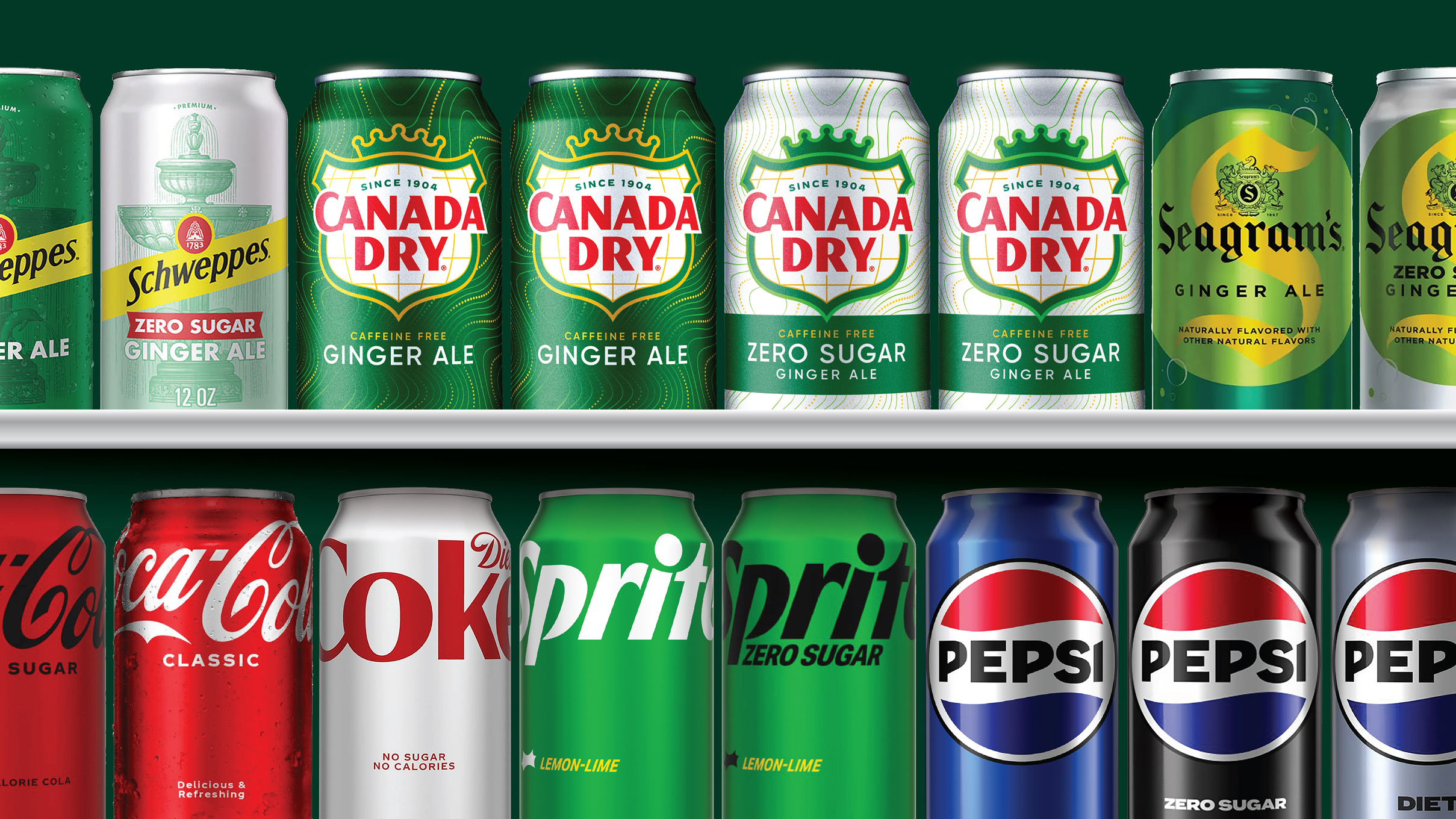
Canada Dry’s color palette has always been central to its identity. But in shelf environments increasingly dominated by hyper-saturated competitors and emerging functional beverages, simple recognition alone wasn’t enough.
By grounding the palette in the emotional resonance of the Canadian landscape — evergreen forest tones, mineral blues, natural golds — the brand reclaimed color as a strategic storytelling tool. This approach echoes quieter evolutions from lesser-known but deeply trusted brands.
Canada Dry’s refined color palette also considered how these hues would perform in the real world—specifically, how they would appear when the product is chilled. Colors were selected not only for their heritage and distinctiveness, but for the way they transform under frosty condensation. When cold, greens deepen, metallics brighten, and whites sharpen, creating an immediate sensory cue of refreshment. By choosing tones that visually “activate” when refrigerated or surrounded by ice, the palette reinforces the brand’s promise of crisp, invigorating taste right at shelf. This ensures Canada Dry looks its most desirable at the exact moment consumers are most primed to reach for it.
For Canada Dry, color became a bridge between heritage and the modern desire for calmness, grounding, and moments of escape.
PRINCIPLE 5
Expanding the Visual Toolkit Unlocks Cultural Expression
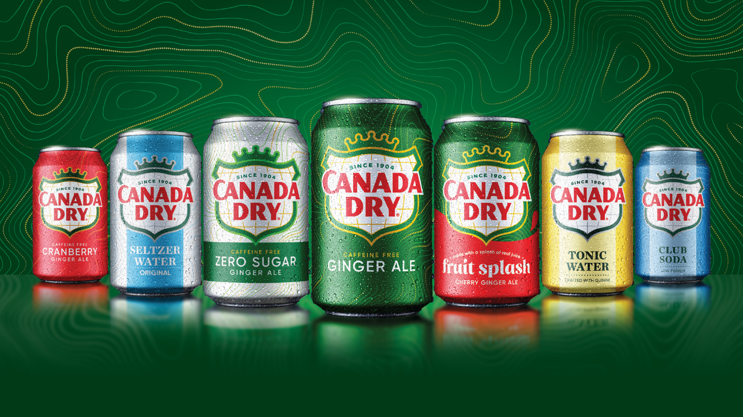
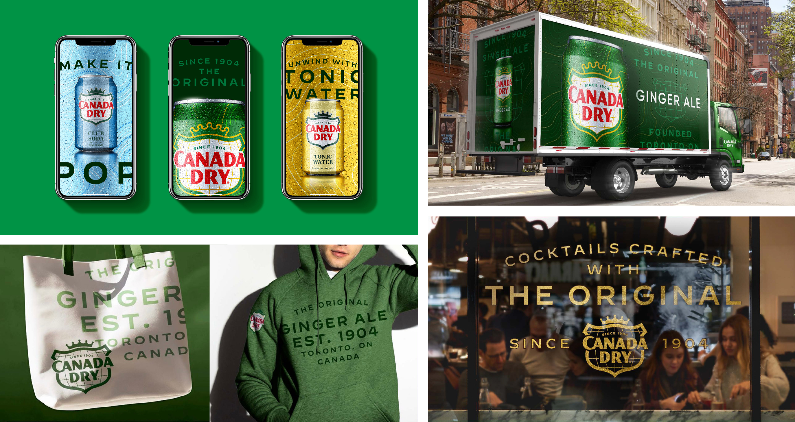
Logos alone cannot carry the narrative demands of the omni-channel environment. Canada Dry needed assets that could flex across digital content, merchandising, experiential activations, and emerging retail formats.
Inspired by the topographic lines in a map of the Canadian Rockies, a new symbolic pattern of was created . These lines evoked natural elevation and beverage effervescence simultaneously, creating a flexible design asset that deepened storytelling without diluting equity. The flowing, textural movement provided a subliminal reinforcement of Canada Dry’s brand strategy: to make the most out of relaxation moments with the original dry soft drink.
Beyond visual elements, additional verbal statements were introduced to articulate and reinforce this promise—short, meaningful cues that invite consumers to pause, enjoy, and embrace moments of personal refreshment. Enhanced brand lockups, designed for off-pack applications, reinforced both heritage and category leadership, giving context and authority to the brand across channels. Together, these refinements provide cultural resonance in a time when authenticity, genuineness, true leadership, and taking time to relax are increasingly valued by consumers.
Canada Dry’s new pattern and supporting verbal system expanded its visual and narrative world from merely “recognizable” to richly expressive, creating a cohesive, culturally relevant ecosystem without compromising familiarity.
PRINCIPLE 6
Visibility Is Earned Through Behavioral Design, Not Aesthetics Alone
CPG brands live or die by how they perform at distance. Canada Dry’s visual system was evaluated through consumer-centric visibility testing at key intervals: 10 feet (navigation), 5 feet (comparison), and 2 feet (decision). Subtle but intentional visual cues—such as a refined color palette within the shield—were carefully introduced to help shoppers instantly distinguish varieties both in-store and online. These nuanced shifts act as navigational anchors, guiding the eye and making it easier for consumers to find the right product quickly and confidently.
This emphasis on perceptual performance reflects a broader shift among sophisticated, often under-the-radar brands that understand the realities of modern shopping behavior. In digital environments, where products may be reduced to the size of a small mobile thumbnail—sometimes as compact as a 44 pixel square icon—micro-differentiators like color modulation, contrast, and shape cues become even more critical. If they don’t register immediately, the brand simply blends into a grid of undifferentiated thumbnails.
The takeaway: beauty matters, but behavioral clarity converts.
PRINCIPLE 7
A Cohesive Brand World Creates Momentum Across Every Touchpoint
A revitalized identity only succeeds when it moves with coherence across all surfaces where consumers encounter the brand. But coherence doesn’t mean sameness. A modern brand world is built from a toolkit—one designed to flex intelligently based on format, channel, location, and occasion. The elements required to stop a shopper at shelf are different from those needed to engage a follower on social, support a retailer in merchandising, or immerse someone in an experiential environment. Effective systems recognize that connection is context-dependent; not everything should match, but everything should feel unmistakably part of the same world.
Canada Dry’s renewed system defined how core equities, expanded assets, color cues, and typography adapt across packaging, social content, merchandising, and experiential touchpoints without losing unity. The work clarified which components must stay consistent and which can expand, shift, or stretch to meet the moment—ensuring the brand speaks with one voice, but in many tones.
The most enduring brands operate as complete ecosystems, not as collections of parts.
Coherence builds trust. Flexibility builds relevance. Canada Dry’s evolution restored both.
PRINCIPLE 8
When Culture Calls, Answer—Quickly and Thoughtfully
Iconic brands don’t manufacture every moment of relevance—sometimes culture does it for them. When pop culture unexpectedly shines a spotlight on your brand—through social media, entertainment, or a viral moment—it creates a rare surge in visibility that money can’t buy. For a brief window, awareness expands beyond a brand’s core audience, introducing it to new generations, new contexts, and new conversations.
This heightened attention is inherently time-bound. Brands that hesitate risk squandering the moment or allowing others to define the narrative for them. While every public response must balance reward and risk, a timely and carefully crafted acknowledgment allows the brand to convert fleeting attention into meaningful recognition—signaling that it is not only being noticed, but is actively engaged with the culture amplifying it.
The most effective responses don’t chase the moment; they frame it. By responding in a way that reflects the brand’s established voice, values, and visual equities, brands can use viral visibility to reinforce who they are, not reinvent themselves. When handled well, these moments function as accelerants—amplifying relevance, strengthening cultural credibility, and reminding audiences that enduring icons aren’t just remembered, they’re still present, aware, and participating in the world around them.
The takeaway: Viral moments are borrowed attention. If you don’t claim them quickly and on-brand, someone else will—often at your expense.
CONCLUSION
Rediscovering What Made the Brand Iconic
Canada Dry’s transformation stands as a broader reminder for any established brand navigating the tension between heritage and modernity:
Icons endure not by preserving the past, but by continually helping consumers see the familiar in fresh, meaningful ways.
Through disciplined extraction, thoughtful refinement, and strategic expansion of its visual world, Canada Dry reclaimed its presence, not through reinvention, but through rediscovery. Its path offers a blueprint for any brand seeking to stay visible, relevant, and resonant in a marketplace where even the most iconic signals can fade into the background.