Dieline Award - 2021
Winner
Transform Awards - 2020
Best Brand Evolution - Silver; Best Use of Packaging - Silver
GDUSA - 2020
Graphic Design
How do you help an iconic American brand update its identity and storytelling while solidifying its place of prominence on shelf?
Design Strategy
Brand Architecture
Brand Identity Design
Packaging Design
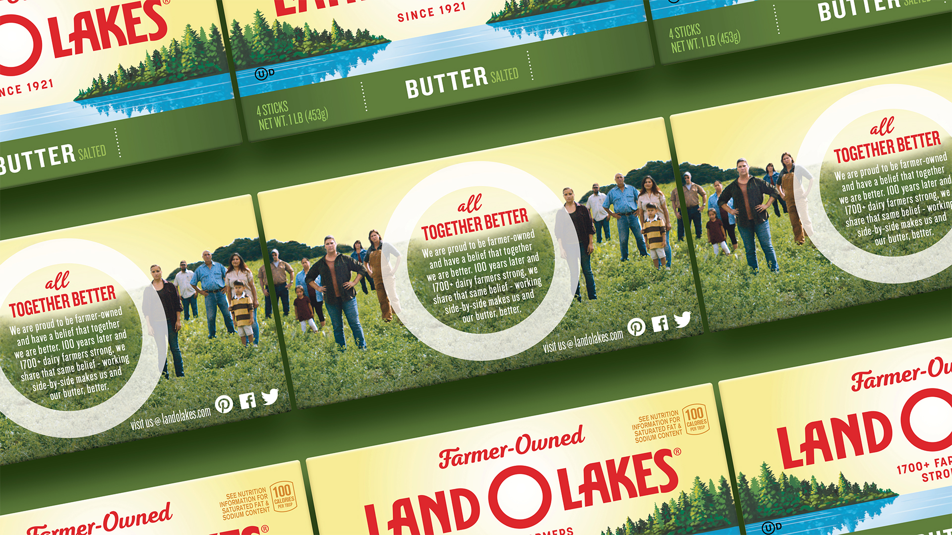
Land O’Lakes consumers liked the brand but research showed they had limited visibility into its heritage as a farmer-owned cooperative. In today’s environment, it matters.
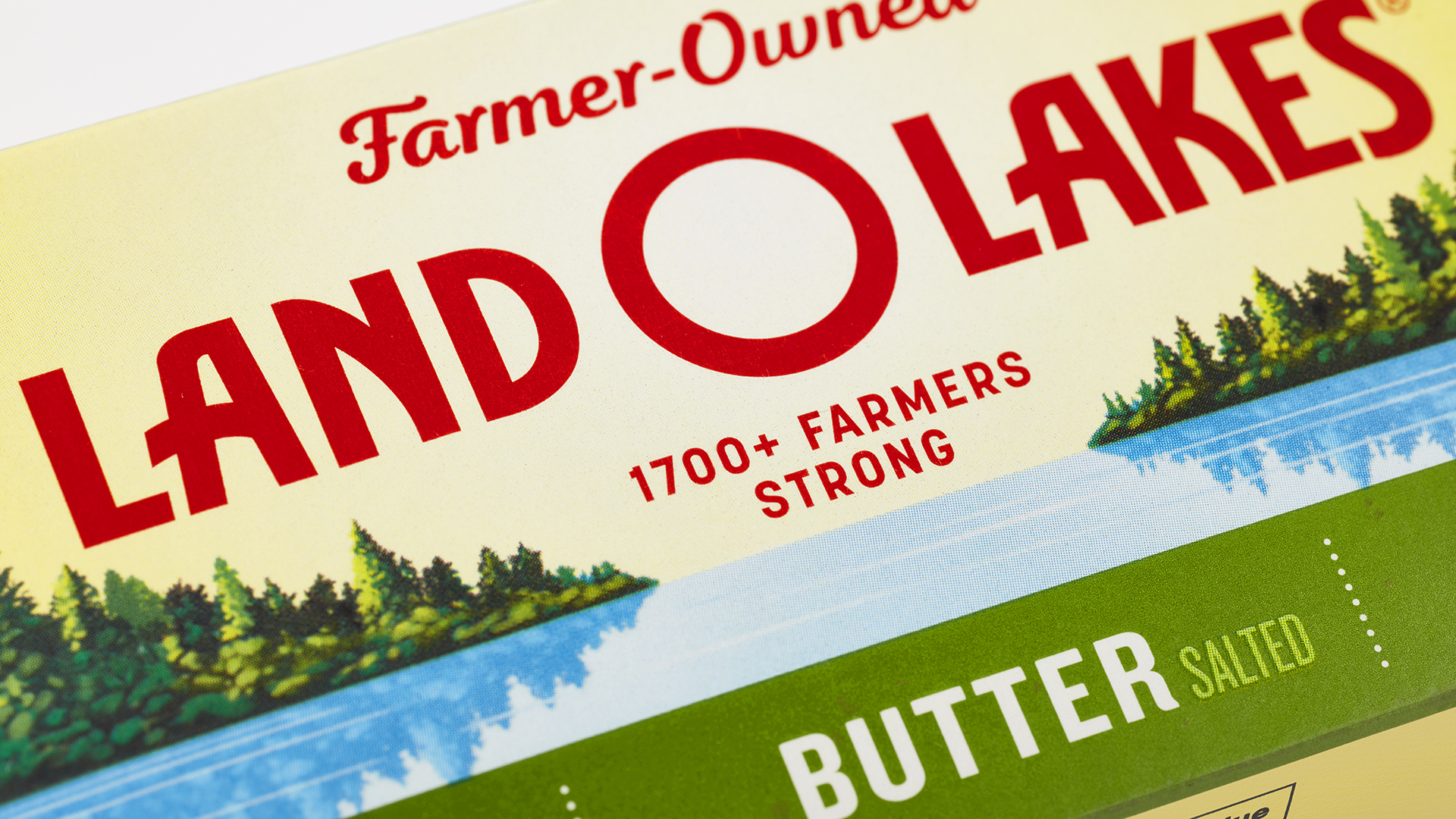
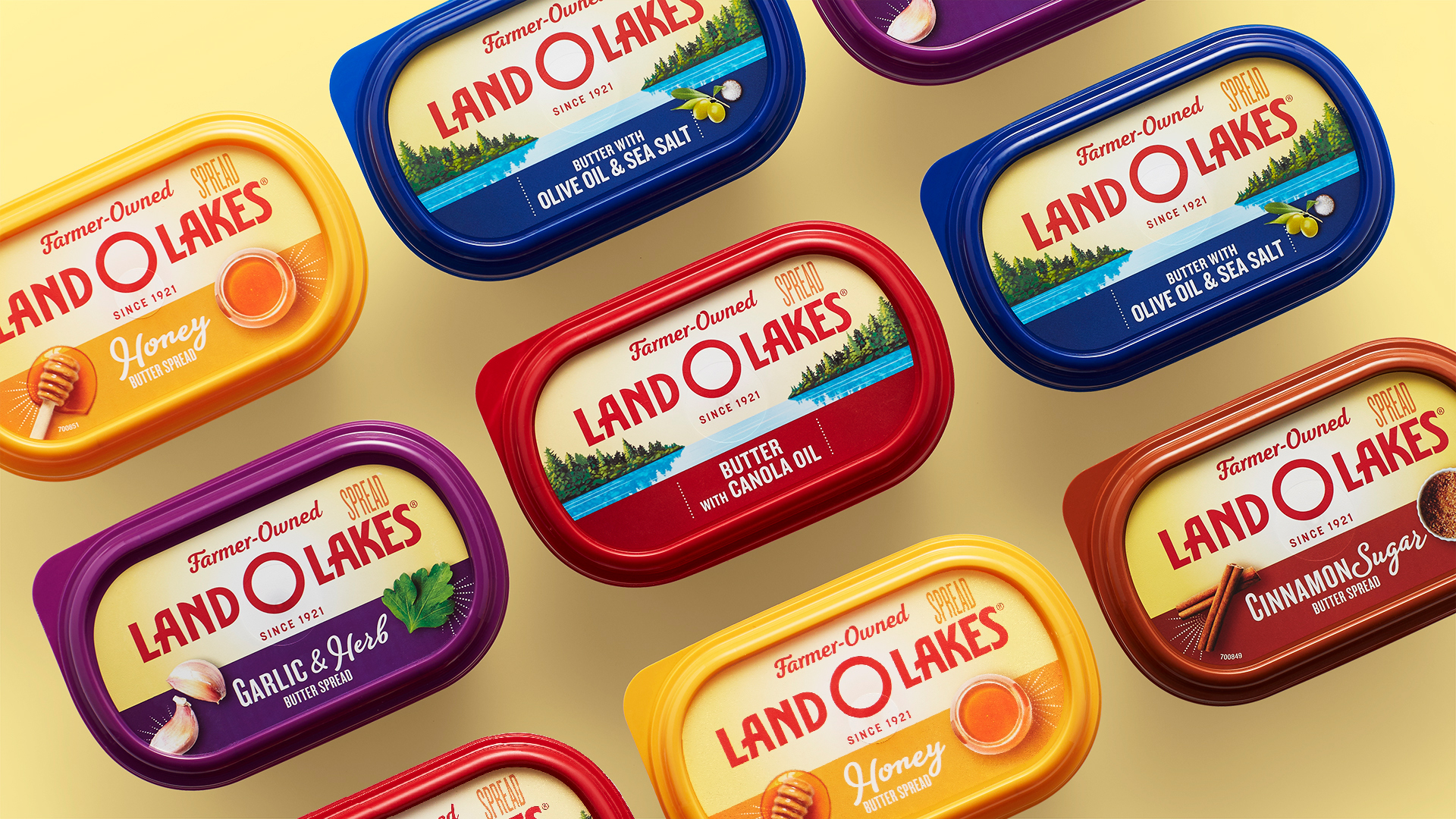
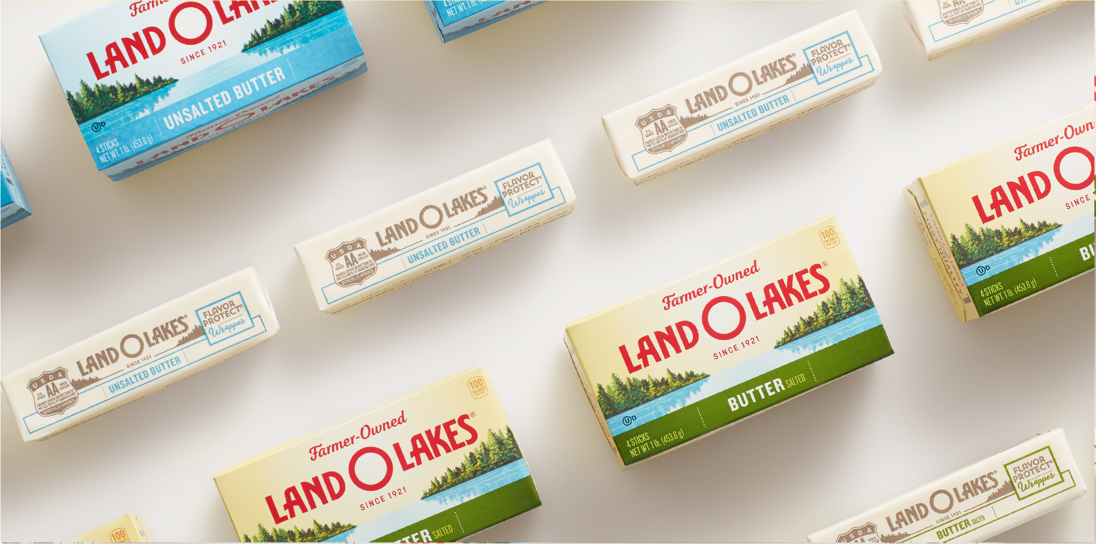
We connected “farmer-owned” directly to the brand mark on pack, updating the design and using photography of actual Land O’Lakes farms to tell a more expansive story about simple goodness. We also simplified the brand mark to create a bull’s eye effect, giving it more impact at shelf. And more consistent flavor naming and color-coding helped simplify the product architecture, making the flavored spreads easier for consumers to discover and shop.
Loading the form…
