The Call
Canada Dry has led the ginger ale and mixer categories for over a century. But in a category where a new brand is born every minute, even icons need to reinforce why they’re the clear choice. Our challenge: help people see Canada Dry again. To remind them why it’s always been the drink of choice when it’s time to relax.
We set out to reinforce what made the brand iconic, while modernizing its expression for today’s shelf, screen, and shopper. The system had to flex across an expansive portfolio, evolve without disruption, and double down on the brand’s leadership.
What we did
Design Strategy
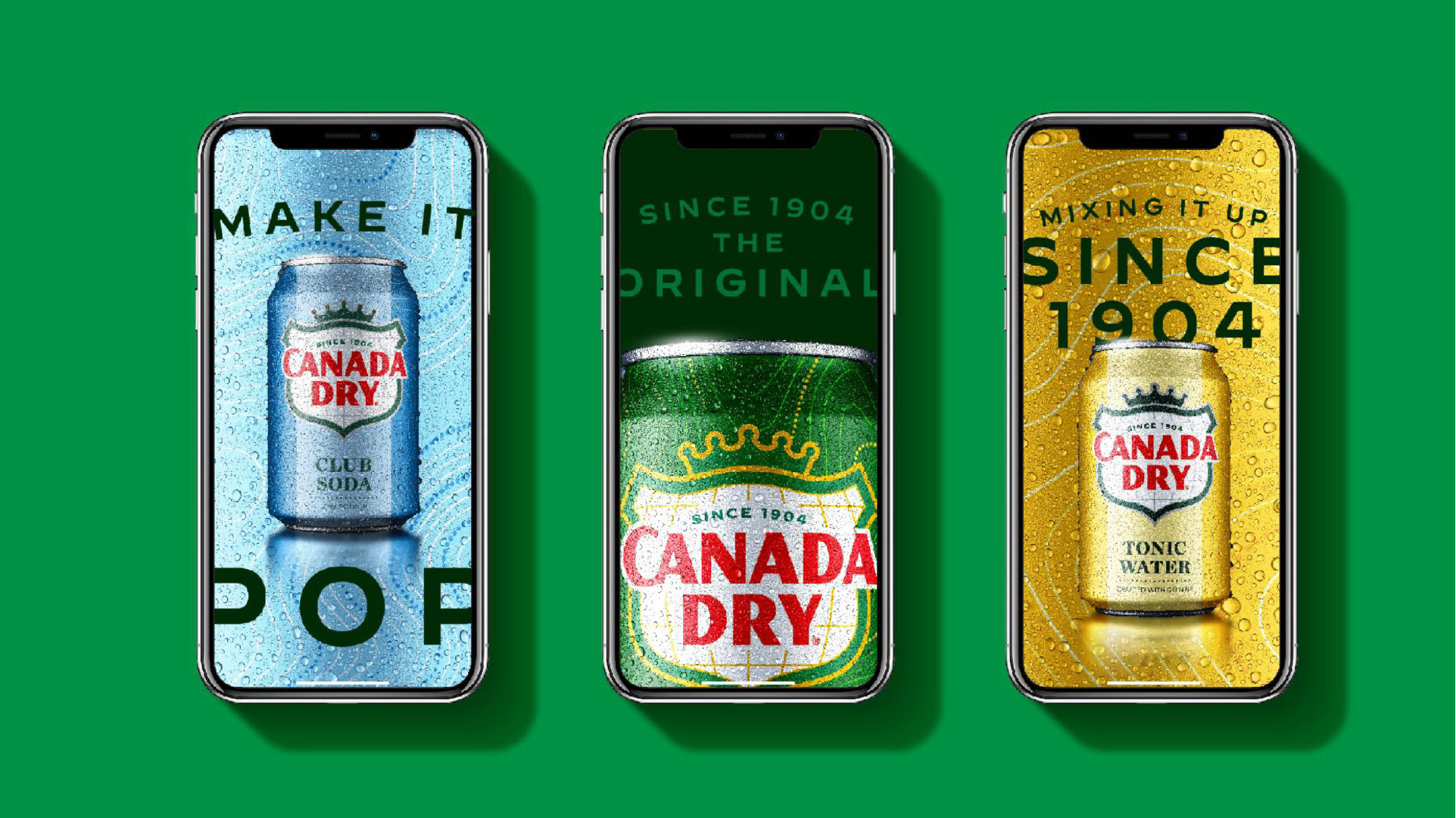
Visual Identity
Packaging Design
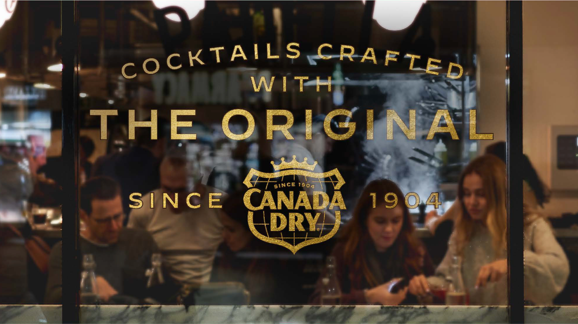
Brand World
Retail Activation
The Work
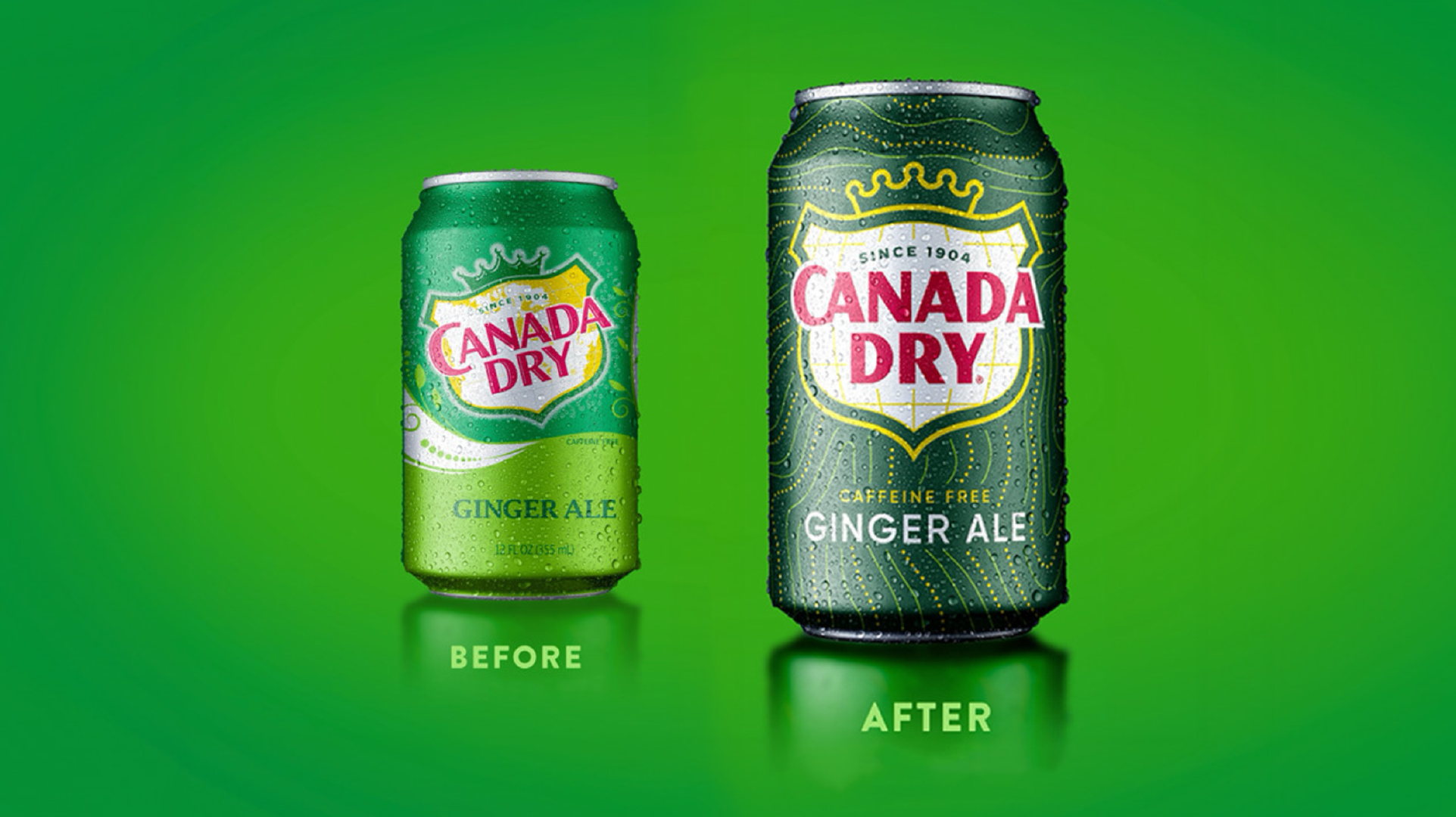
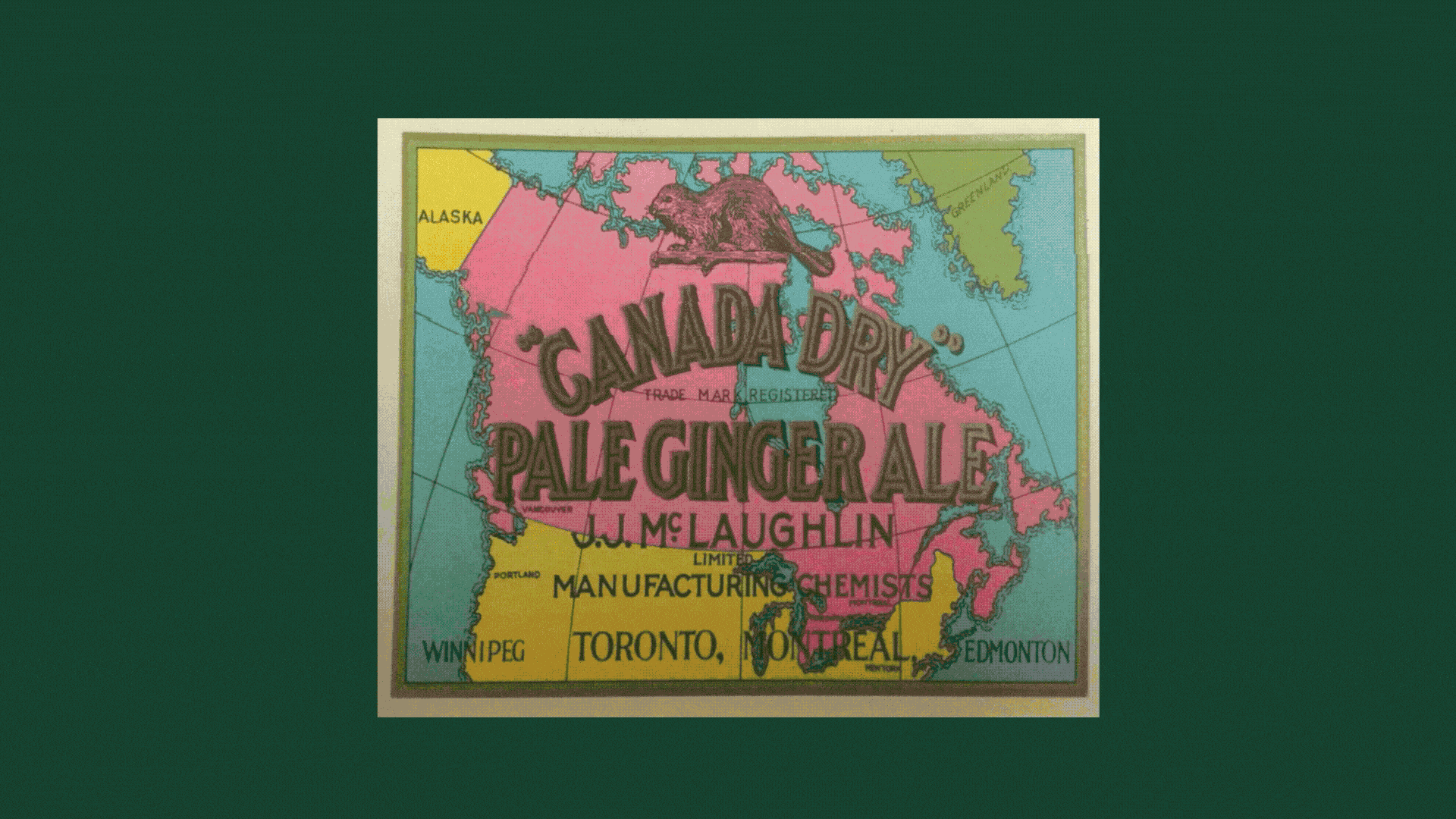
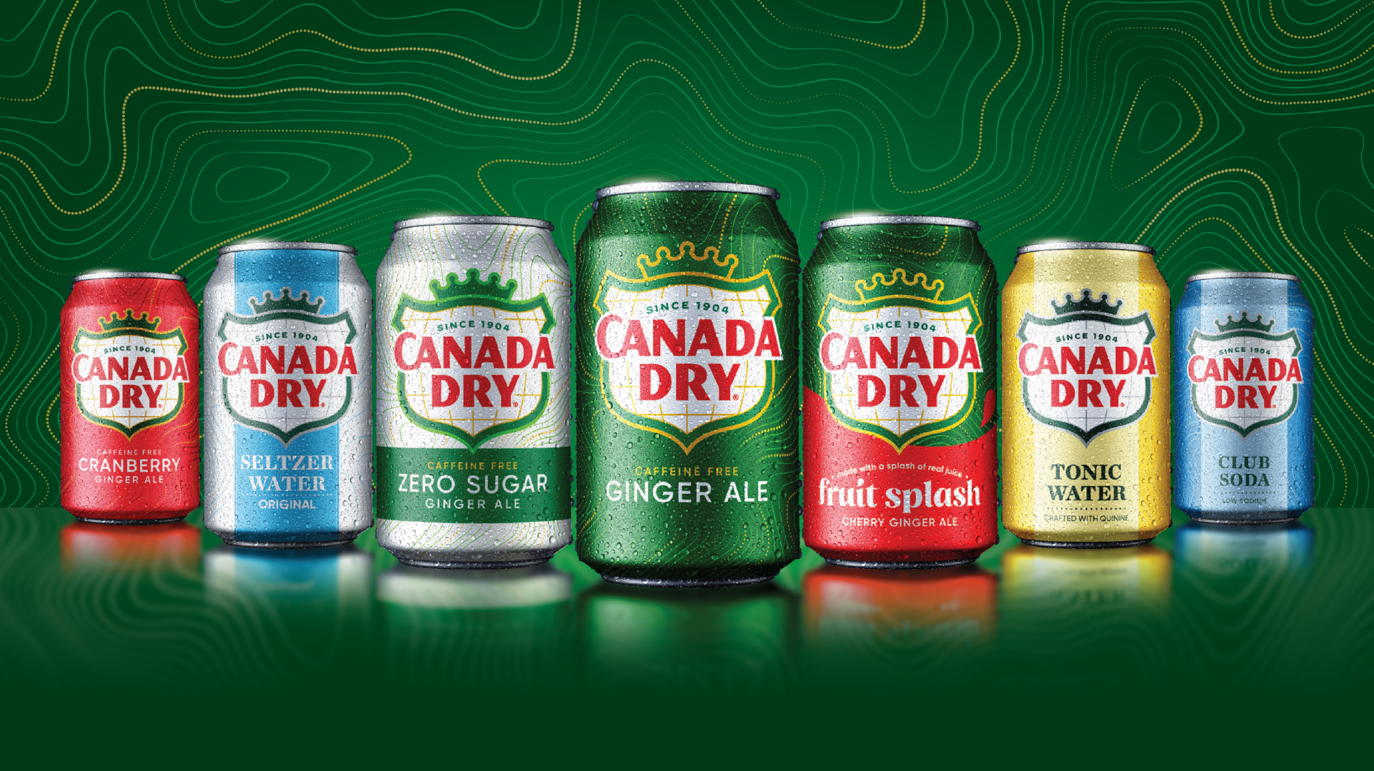
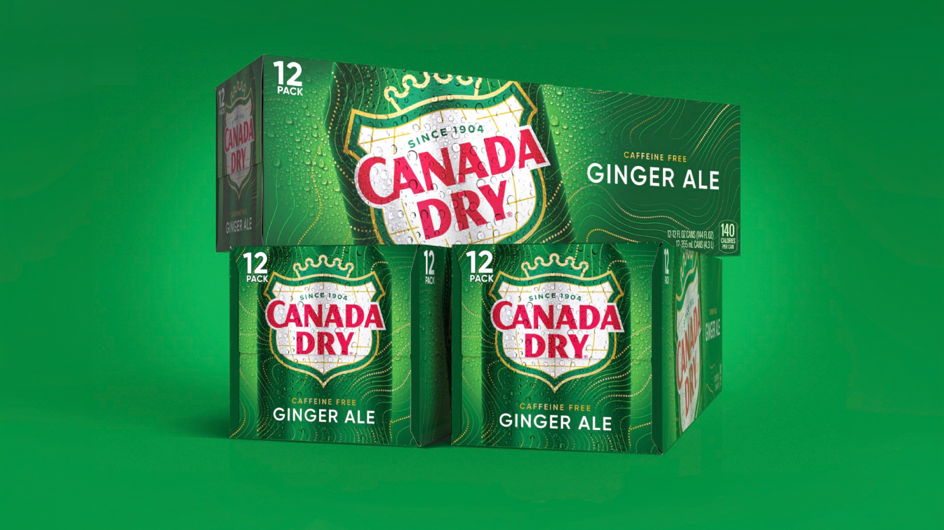
We began by unpacking what makes Canada Dry unmistakably Canada Dry. We studied the brand’s visual equities to determine what to preserve, what to evolve, and what to retire. Our goal: simplify and sharpen the brand’s most recognizable assets to maximize impact and reinforce its position as a category leader. The iconic shield was redrawn for better visual balance and straightened to project a stronger sense of authority. We also brought back the original “CA” ligature, restoring a distinctive touch of heritage.
But the brand needed more. To support its strategy of inviting consumers to unwind in a hyper-busy world, it needed a new visual asset—something fresh to make people look again. Inspired by Canadian topographic maps, we introduced an effervescent pattern that brings movement, flow, and modernity to the system. It serves as a dynamic backdrop for the brand’s signature elements. We also updated the color palette: deepening the rich emerald green of Ginger Ale (a subtle nod to Canada’s evergreen forests) and selecting jewel tones that express the vibrancy of Canada Dry’s flavors and mixers. Even the satin finish on the cans was intentional, adding tactile elegance, signaling quality, and enhancing refreshment cues when cold.
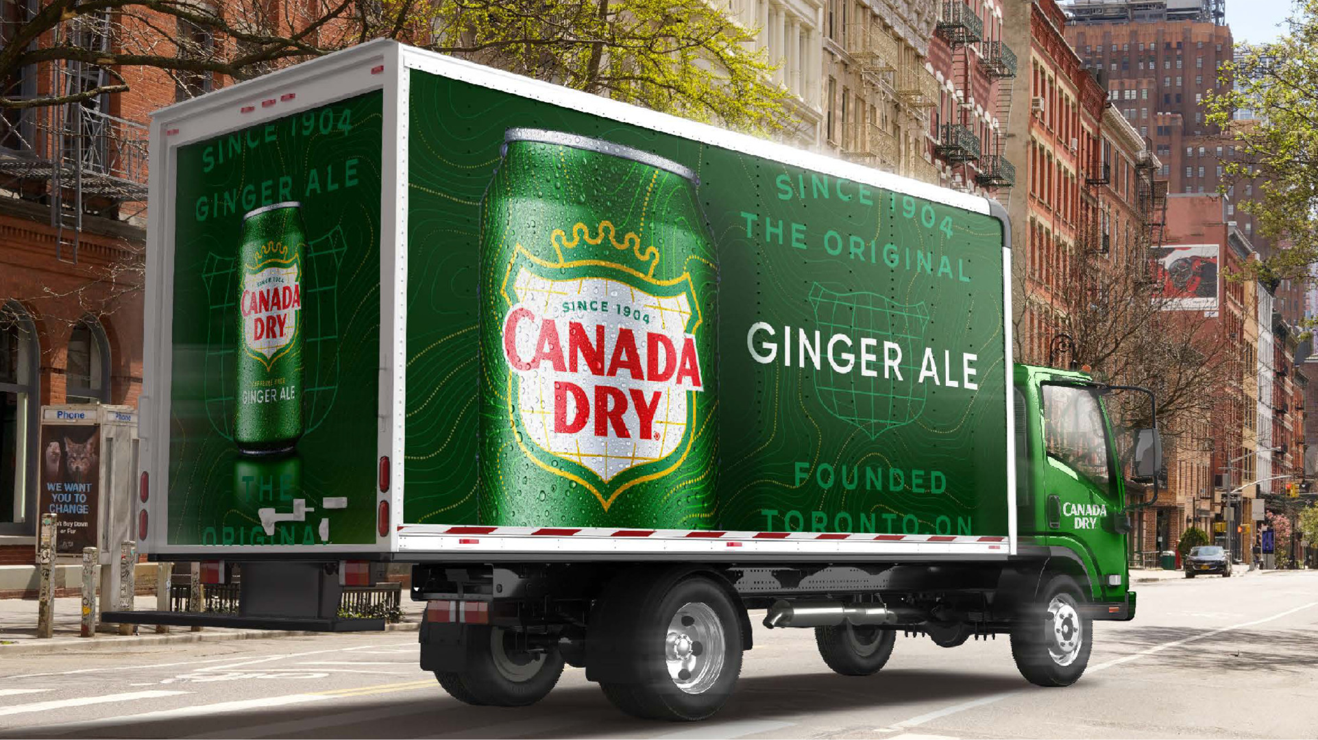
From there, we reimagined the brand’s full visual ecosystem—from on- and off-premise activations to vending machines, fleet vehicles, and merchandise—ensuring Canada Dry connects meaningfully wherever its consumers are.
The Impact
- Canada Dry grew +9.8%, nearly double the category growth of 4.5%
Outperformance that reflects the combined impact of design, innovation, and retail execution - 72% of sales were incremental to the CSD category
The brand didn’t just take share—it brought new growth into the category - 1MM+ new buyers entered the Canada Dry franchise
Visual and portfolio updates helped extend reach beyond the core audience - 33% of trialists were net new to the trademark
The redesign successfully brought new households into the franchise - Design testing confirmed improved visibility and navigation
Consumers responded to clearer cues, better shelf standout, and stronger brand clarity - $100MM in Year 1 sales for Fruit Splash
The redesigned system helped drive breakthrough performance across the portfolio - #1 CSD Innovation Launch of 2024 (YTD) in both dollar and volume sales.
Canada Dry led category innovation, a reminder that strategic design, whether refined or rebuilt, moves markets